Time Series Graph
First select your data.

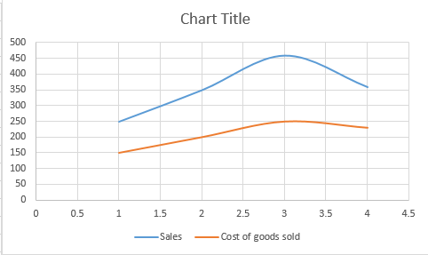
Then go to Insert > Scatter > Scatter with Smooth Lines. You will get a chart like this:

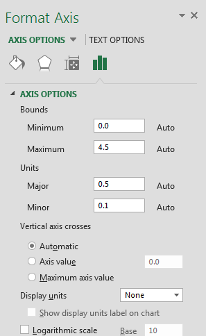
Edit horizontal axis. To edit horizontal axis right click horizontal and go to Format Axis. A tab will appear on the right.

Under axis options, change maximum to 4 and major (under units sections) to 1.

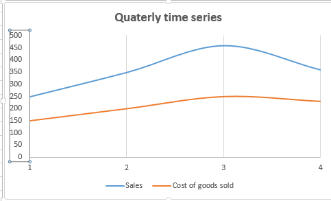
Delete horizontal gridlines. Your final graph will look like this.

Template
You can download the Template here – Download


