
Gauss Chart in Excel
 The normal distribution, also called the Gaussian distribution is one of the most important probability distributions. It plays an important role in the statistical description of the issues of natural, industrial, medical, social, etc. The reason is its prevalence in nature. If a size is the sum or average of a large number of small random factors, regardless of the distribution of each of these factors, the distribution will be close to normal, so it can be very often seen in the data. In addition, the normal distribution has some interesting mathematical properties that make it based on statistical methods are computationally simple.Let’s learn how to create a Gauss chart in Excel.
Preparing data to Gauss Chart in Excel
In addition to the mean and standard deviation – the two basic parameters that describe the normal distribution – we need more bands, which allows you to move the desired graph on the horizontal axis. We create two sets of artificial: Series 1 contains the number rising by 0.25 (from -5 to 5), and Series 2 = Series 1 * standard deviation + average

Then in the third column, insert the NORMDIST function, using data from the second series.

Inserting Gauss Chart in Excel
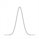
With so prepared data Select the columns and the Series 2 and insert the normal distribution scatter plot with smooth lines. We obtain the following graph.

After a small correction is obtained formatting beautiful shape of a bell. It is Gauss Chart:

Now, changing our input parameters – mean and standard deviation – we can see changes immediately in the chart. Interestingly, the normal distribution perfectly describes such intelligence, height or intensity of the light source.
Template
Further reading:
Basic concepts
Getting started with Excel
Cell References


