
The Ultimate Pivot Table Guide
What is Pivot Table?
Pivot table is a powerful analytical tool in the form of a table. The biggest advantage is that you are able to freely “rearrange” data. Thanks to it you can see in our data trends, patterns and comparisons that are difficult to find by browsing them manually. It is indispensable in creating summaries and reports, which is why many employers are looking for people who can use them.
If you have a large amount of data, it can sometimes be difficult to analyze all the information in a worksheet. PivotTables can make it easier to manage worksheets by summarizing the data and allowing you to manipulate it in different ways.
Unfortunately, many people do not use PivotTables, mainly for fear of the advanced nature of their actions. Fortunately, it’s not that difficult. PivotTables do not require special knowledge, and their construction can be understood even for novice Excel users. It is only necessary to bear in mind a few basic assumptions that I will present in this tutorial.
Data Preparation
Before you start creating a Pivot Table, you should verify that the data you analyze is properly organized. Things you should check:
- Column headings – if they are unique, placed at the very top, in one single row. Also columns can’t be empty
- Rows – each one of them has to have the same number of columns
- Cells – none of the cells are merged
- Separation – the data to be analyzed shall be separated from the others by at least one empty column and one empty row
- Data meaning – each row is an item (city, person, product) and each column is information about that item (date, name, amount, size)
- Common parts – in order for the use of the Pivot Table to bring real benefits, at least in some columns there should be repeated elements – according to these elements can be grouped
- Avoid empty rows – blank row will cause only part of the table to be used in the Pivot Table
- One data type in a column – a Pivot Table performs some operations only on a specific data type (eg. only on dates or only on numbers). If you try to group dates and at least one cell will be another type, you won’t be able to group them because of the type inconsistency
- Valid data type in a column – sometimes the data looks correct, but it is not at all. Be careful especially after getting data from external source. Make sure that numbers are real number and not a text. It matters because Excel is not able to sum texts
- Subtotals are not allowed. Make sure your table does not contain them and any rows with a summary of parts of the data.
How to insert Pivot Table?
I have prepared the sample sales data in the imaginary company and use it as an example.

In Below table contains columns such:
- date
- product
- category
- customer
- customer crm group
- region
- state
- city
- sales manager
- sales rep
- price
- quantity
- sales
Inserting of Pivot Table begins from a ribbon. Go to the Insert. Pivot Table is the first button on the left. Press it and select Pivot Table.
Another possibility is to use the keyboard shortcut ALT + N + V.

To create pivot table you need to just choose the proper range of cells. In most cases Excel identifies the correct range so. After double checking click OK to get the empty pivot table in the newly created worksheet.

Populate Pivot Table With Data
On the right side of the screen you can see the labels of your columns (PivotTable fields) and 4 areas to choose. This is basically the window where you will be creating your pivot table. Thanks to a few drag and drop moves pivot table will group your data and perform calculations for given data set.
If you are doing this for the first time it might be a good opportunity to play a bit. Try to drag your columns and drop them in the areas. See what happens and how your pivot table changes.
As you can notice and this point there are endless possibilities to create different tables based on the same data set. The only limitation is your imagination.

There are common rules which you may follow when creating the real pivot table:
- Filters: this is where you can put the column which will be the filter of your table. It may be a person, date, region etc. After enabling the filter you will filter the table just for this person/date/region.
- Rows: you shouldn’t have problems with this one. This is the core of the table. Just put the column for which you want to build the table. You would like the check the sales for regions you put regions, number of orders for states you put states, average revenue for salesman you put salesman and so on.
- Columns: if Rows is for WHAT to check then Columns will be for WHERE to check. Report for regions sales of products – you put products to Columns
- Values: in most cases you will use it for sales or numbers of something (orders, measurement’s etc.).
The more you will try this the more confidence you will get.
Please notice that you can put two different columns to the same area. Pivot table will expand a lot but report will be more detailed as well.
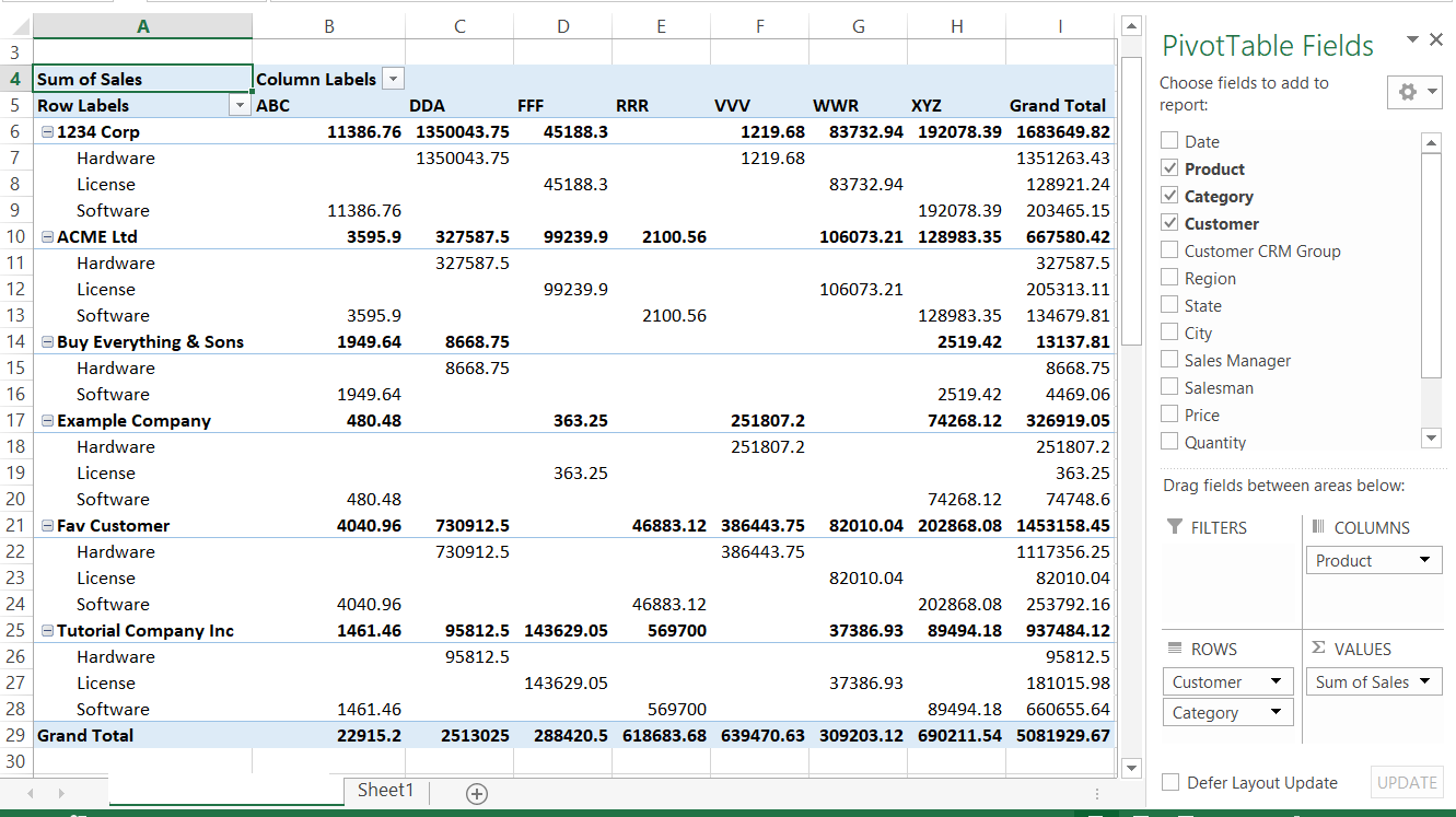
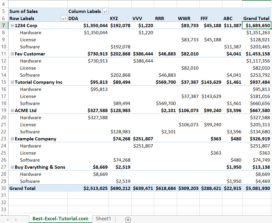
Let’s see the examples. First I prepared the basic report of sales products for customers.

You may notice that Excel calculated many useful numbers here. You can see sales of every particular product for customers. Rows and columns are also summed up.
There is a basic pivot table. You may build bigger ones.
After adding additional categories of products the pivot becomes more detailed but more difficult to read.
Let’s move on to see what you can do to create better reports.
Formatting Pivot Table
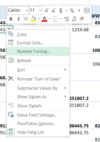
First think I’d like to improve in my pivot table is number formatting. Right click in the data values and choose Number Format.
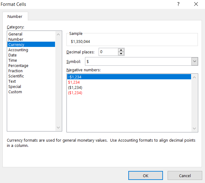
I’d choose Currency format to identify values properly as sales revenues. Also I am reducing decimal places to 0 to make some more space in the report.
Number formatting brings benefits. Report is looking much better now. Also there is a better visibility of data.

Sort Pivot Table
Visibility is better but there is a simple method to increase it even more. Sorting pivot table is the method.
Click in the very bottom row with your mouse button and choose Sort and Sort Largest to Smallest.
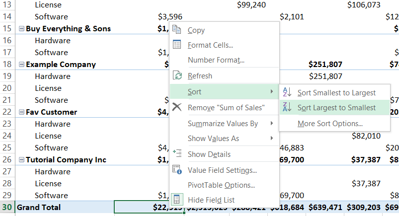
Do the same to the last column.

This is how the report changed now.
You can spot the difference. It is much better to read this pivot table now. The sales decrease from left to right and from the top to the bottom. It is easier to pay attention to the data which are closer. Also it is more professional to keep your pivot table in such order.
Instead of sorting sales data you can use another kind of sorting or even sort manually.
Filtering pivot table
In such shape this is very complex report. You may need to filter the data. Let’s add some labels to the filter area. I decided to add Region, State and City.

Filter showed up in the very top of pivot table. I decided to focus on the sales data from Central region and only for Kansas. Also I have possibility to filter by City ready when needed.

This is how my pivot table changed. Only Central/Kansas is here. Please notice that data is still sorted in the correct order.
Slicer
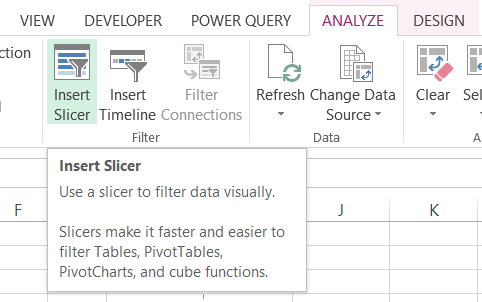
Another way of filtering Pivot Table is to use Slicer.
Slicer is a tool which literally slice your pivot table. Use Slicer to quickly filter out data you don’t need. For example you can use slicer during the presentation, when your boss asks or to check something on a fly. Thanks to Slicer you can for example see data only for particular country, region or customer.
To insert Slicer click a cell in the pivot table. Next go to Ribbon to Analyze Tab.
Choose Insert Slicer button.
You will see a new window Insert Slicers.

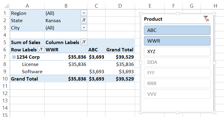
Choose whatever you like. Let me click Product to see the list of products.

From the Slicer itself I can see useful information already. Even before accepting it. I can see one product greyed out. It means that there is no data for this product. I can choose one of the products and quickly see filtered data.
At this point you can click each of them and see how your pivot data changes. Slicer is filtering your table very quickly. It’s amazing!
If you want to choose more than one just hold CTRL key and click another product.
Isn’t it enough for you? Add another Slicer then.
To add second Slicer do the same. Click a cell in the pivot table and use Insert Slicer ribbon button again. Another Slicer will appear.
This time I added Customer filter.
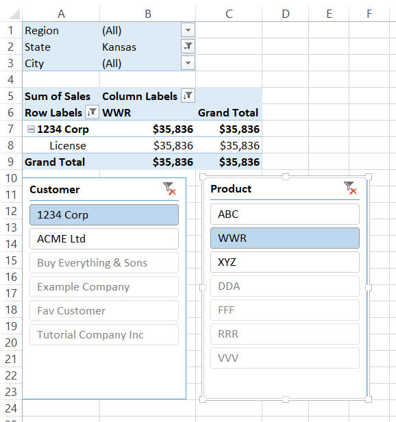
Below data is filtered out as I wanted.
You don’t like Slicer? No problem. You can remove it. Just right click Slicer and click Remove option.

There is also a possibility to keep Slicer and remove its filter. Then you should just use Clear Filter.
Updating (refreshing pivot table)
One thing you need to remember. Pivot Table does not refresh automatically (be default) every time when your source data table changes. This would consume to many of Excel resources. To update pivot table data you just need to right click your pivot table and choose Refresh option.
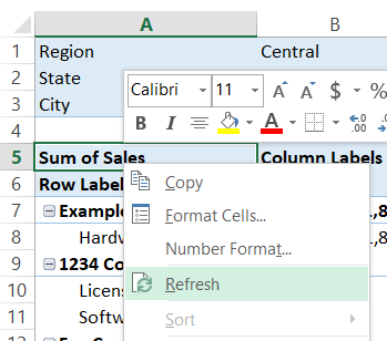
It takes just a second to update the data. Pivot table formatting remains the same.
There is much more you can do with your pivot table:
- Create Pivot Table from Multiple Sheets
- Add calculated field
- add pivot average
- and much more
Template
Further reading:
Basic concepts
Getting started with Excel
Cell References


