How To Create KPI Dashboard In Excel
Creating Excel dashboards can now be carried out without worrying yourself about additional software. If you are looking to build a KPI dashboard in Excel, follow these steps below:
Researching Your Dashboard Before you start creating your charts, you may want to conduct a little research to find out which Excel dashboard will be suitable for your project. This will save you a whole lot of time creating charts and analyzing data. Here is how you are going to research your dashboard:
- Understand the reason you are creating this dashboard.
- Where are you going to get your data from?
- How often do you want to get it updated?
- Who is the report meant for and in what format are they going to receive it?
- you answer the above questions well, then you can proceed to the next step.
Set-Up Your Excel Dashboard File
Click the Excel icon and create three sheets in the file. The file will contain; Raw Data, Analysis, and Dashboard.

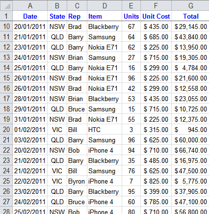
Import your raw data or copy and paste it if you have it in a place where you can’t import. Ensure that the data is in tabular format. This will make it easier to compute with tools like COUNTIFS, SUMIFS, and other Excel tools. If the data cannot be set-up in this way, the whole computation may be more difficult for you. Your Excel spreadsheet will look like this:

Analyzing your Data
There are lots of data analyzing options you can use in Excel. Some of them are: Named Ranges shapes, form controls, conditioning formatting, data validation, Excel tables, and pivot points. You can make use of different formulas as well, including:
- GETPIVOTDATA
- CHOOSE, INDIRECT, OFFSET
- OR, IFERROR, IF
- MATCH, INDEX, HLOOKUP, VLOOKUP
- DMAX, DAVERAGE, DSUM (database functions)
- RANK, LARGE, SMALL, MAX, MIN, COUNTA, COUNT
- COUNTIFS, AVERAGEIF, AVERAGEIF, SUMIFS, SUMPRODUCT
All these tools can be used to manipulate your data, but just a handful of them will be enough for setting up your KPI dashboard.
Data Crunching
Now that you are set to finish your analysis, set-up a data table to feed each table or chart in your dashboard. Pivot points or formulas can be used to extract the important data. The number of formula combinations you select will depend on the amount of data you are working on. Large amount of data will require more formulas to speed things up. If you are using the latest version of Excel or the 2010 version, the SLICERS feature will come in handy to help you navigate and control the pilot tables. If you make use of formulas, then it is important to format the data in the table and work on the data using structured format.
Build The Excel Dashboard
After completing the analysis, the next step is to build the Excel dashboard and add your chart. When building the dashboard, try as mush as possible to make it interactive. Users should be able get responses to their queries without any need for you to create another report. This can be done using Excel drop-down list, or what is usually known as Data Validation list. Just link the validation list to the formulas. This makes the data automatically update itself when the reader selects a new query. You can add extra features to the dashboard by differentiating animated charts and time periods using color.


