
How To Create A Graph In Excel
Plotting a graph in Ms-excel is very simple and easy to perform the task. It is very quick, fast, and useful for representing any calculations using charts and graphs. In Microsoft Excel, there are varieties of graphs and charts available that are used accordingly. But one should know that there is a difference between a graph and a chart.
Graphs Vs. Charts
Both terms are technically interdependent and are different from one another, but both represent data values. A chart such as a Pie chart is used for representing a relative share in a particular data. For example, A plot division between three men in the form of percentage can be displayed using a pie chart.
On the other hand, a graph is used for representing variations in the values for the given data for a particular time duration. A graph is simpler than a chart. For example: To interpret data of a company sale in past 5 years can be easily represented via an appropriate Graph.
Varieties of Graphs in Ms Excel
Excel has leveraged its users by introducing the following varieties of graphs:
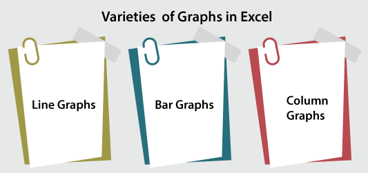
- Line Graphs: The most common graph is the line graph, and every ms excel version offers 2D and 3D line graphs through which a user can represent the flow/variations in the values of the given data. There are different types of line graphs available, and the user can use that accordingly.
- Bar Graphs: Ms excel offers bar graphs in different varieties, and it is used for representing the variations in the values of the given data for a particular time duration. In bar graphs, the variables are plotted against the x-axis, and the constant parameter (like time duration) is assigned to the y-axis.
- Column Graphs: Its role is the same as a bar graph for representing the variations in the data values, but a column graph can be called a graph when a single data parameter is only used because, in the case of multiple parameters, it becomes typical for the viewers to understand how the variations are made.
Where these Graphs are available
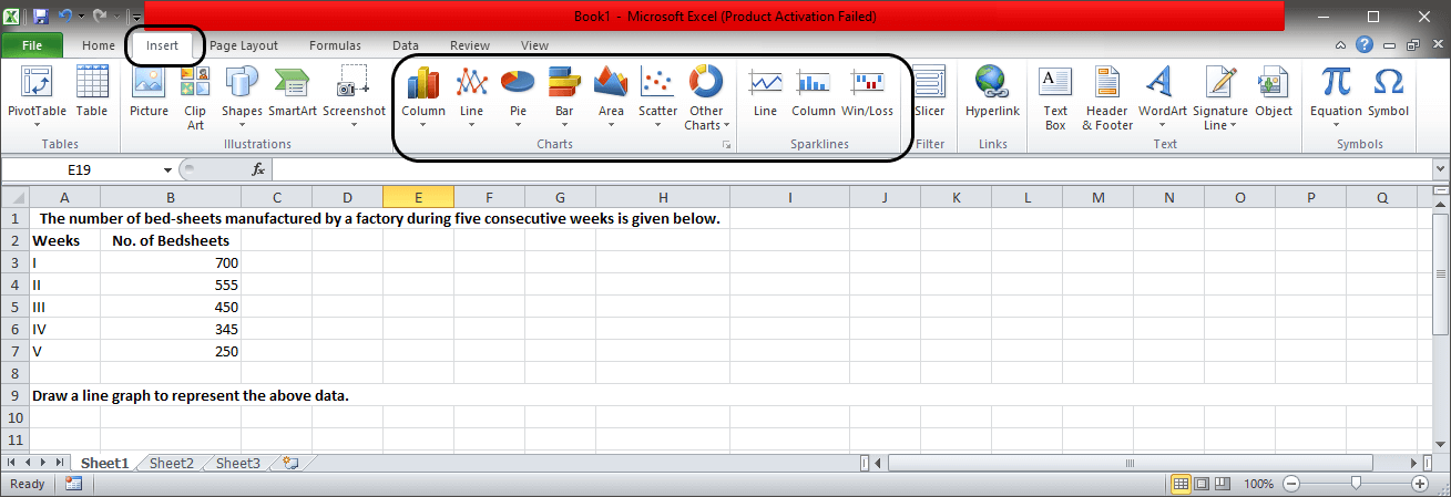
Open MS Excel > Insert, and there you will see all the available charts. You can see in the below figure:

Creating Graph in Excel
Here are the steps using which we can create graphs for representing the given data values:
Step 1: Open MS excel on the system, no matter the version you have. Graph feature is available in every excel version.
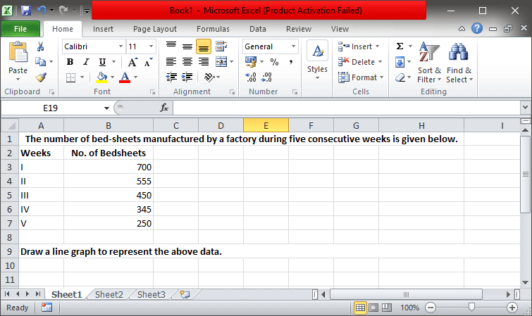
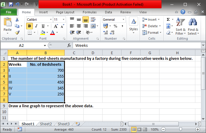
Step 2: Take or import the data you want to represent and enter it into the excel spreadsheet. Set all the data values in the rows (represented with numbers and marked horizontally) and columns (represented vertically and marked with alphabets). We have created a data representation as shown below:
Step 3: Under Home, click on the Number section for assigning the right data type to the data columns. Assigning the right data type will help you set and represent the data values correctly. The snippet is shown below:
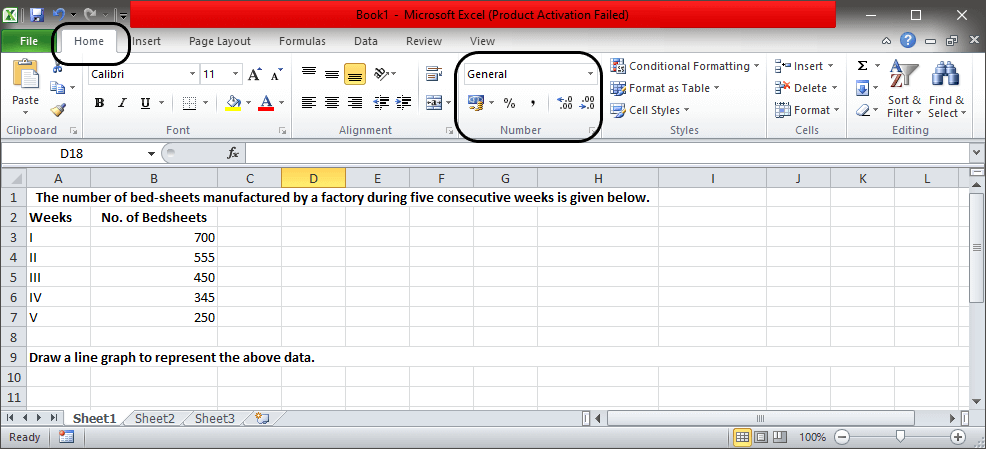
Here, we have assigned General type for our data.
Step 4: Now move to Insert, which is next to Home, and there you will see the varieties of Charts as shown below:
Step 5: To choose the appropriate graph suitable for your data, you need to examine the type of data and different parameters you are working with.
Note: If we do not want every parameter to be represented in the graph, we need to make the smart selection for which, move to the cell that you want in the graph. Bring the mouse cursor on the cell name that you want to select, let say A, so keep the cursor on it, and you will see a downward-facing tiny arrow and click. The whole column of A will get selected.
Step 6: Now, if you want to select more than one cell, then drag the mouse, and multiple cells will get selected. The snippet is shown below after making multiple cell selection:
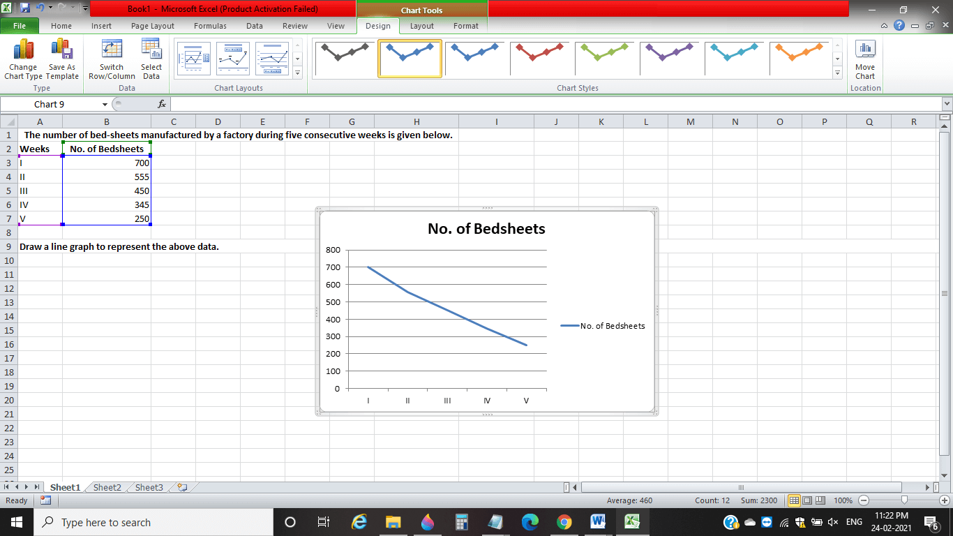
Step 7: Now, as per your data, choose the appropriate graph, and for our data, we have selected the 2D line graph, as you can see in the below snippet:

You will notice that as soon you select the graph, a graph will appear on the sheet, as you can see in the below snippet:
However, on making incorrect data type selection, the graph may not come out to be appropriate. But we can improve our created graph using the Chart tools provided by Excel.
How to make the graph attractive and presentable
Here are the tools of Ms Excel through which we can improve and make the graph more attractive:
- Design Tool: The tool is present next to the View tab and allows us to relocate and design our graph more precisely. We can change the chart type through the design tool and use the appropriate layout as per our need.
- Layout Tool: This tool is present next to the Design tab that allows us to re-title the chart, re-title the axis, adjust the gridlines and reposition the legend. In short, use the layout tool to give a great look and layout to the created graph.
- Format: The Format tool is the last and present next to the Layout tab in the excel sheet. Using the tool, we can set the width, border, and color around the created graph to differentiate between the filled data points.
A snippet showing the presence of the excel tools is shown below:

Challenges
In the case of simple data sets, it is simple to create a graph. But when adding different types of data with multiple parameters, one will face the below challenges:
- Sometimes we may forget to remove the duplicates, especially when the data is imported to the excel sheet.
- When creating graphs, data sorting can create problems.


