
Excel Charts
In Excel, a chart is a tool used to communicate data in visual representation. Charts are usually used to analyze trends and patterns in data sets. Excel provides 12 types of charts, and each one has different features that make them better suited for specific tasks. Pairing a chart with its correct data-style will make the information easier to understand, enhancing the communication within your small business.
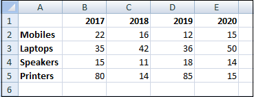
For example, if you have been recording the sales figures in Excel for the past few years, then using charts, you can easily tell which year had the most sales and which year had the least. You can also draw charts to compare set targets against actual achievements.
NOTE: If you have Excel 2013 or lower versions, some of the more advanced features may not be available.
How to Create a Chart in Excel?
Follow the following steps to create a chart in Excel:
Step 1: Select the data for which you want to create a chart.
Step 2: Click on the Insert tab and go on the recommended Charts option.
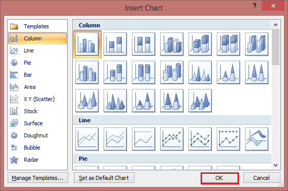
On the Recommended Charts tab, scroll through the list of charts that Excel recommends for your data. If you don’t see a chart you like, click All Charts to see all the available chart types.
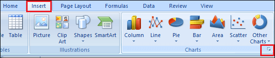
Step 3: Select the chart type according to your data and click on the Ok button.
Step 4: Use the Chart Elements, Chart Styles, and Chart Filters buttons next to the upper-right corner of the chart to add chart elements like axis titles or data labels, customize the look of your chart, or change the data is shown in the chart.

Step 5: To access additional design and formatting features, click anywhere in the chart to add the CHART TOOLS to the ribbon, and then click the options you want on the DESIGN and FORMAT tabs.
Types of Excel Charts
Different scenarios require different types of charts. Excel provides different types of charts that suit your requirements. The type of chart that you choose depends on the type of data that you want to visualize. To help simplify things for the users, Excel 2013 and above has an option that analyses your data and makes a recommendation of the chart type that you should use. You can also change the chart type later.
Below are some of the most commonly used Excel charts and when you should consider using them.
1. Column Chart
The column chart is the most commonly used chart. It is best used to compare information or have multiple categories of one variable, for example, multiple products or genres.
A Column Chart typically displays the categories along the horizontal axis and values along the vertical axis. To create a column chart, arrange the data in columns or rows on the worksheet. A column chart has the following sub-types:
- Clustered Column
- Stacked Column
- 100% Stacked Column
- 3-D Clustered Column
- 3-D Stacked Column
- 3-D 100% Stacked Column
- 3-D column

2. Line Chart
Line charts can show continuous data over time on an evenly scaled axis. Therefore, they are ideal for showing trends in data at equal intervals, such as months, quarters, or years. The lines connect each data point so that you can see how the values increased or decreased over a while.
- In a Line chart, category data is distributed evenly along the horizontal axis.
- And the value data is distributed evenly along the vertical axis.
To create a Line chart, arrange the data in columns or rows on the worksheet. A-Line chart has the following sub-types:
- Line
- Stacked Line
- 100% Stacked Line
- Line with Markers
- Stacked Line with Markers
- 100% Stacked Line with Markers
- 3-D Line charts

3. Pie Chart
Pie charts show the size of items in one data series, proportional to the sum of the items. The data points in a pie chart are shown as a percentage of the whole Pie. Each value is represented as a piece of the Pie so you can identify the proportions. To create a Pie Chart, arrange the data in one column or row on the worksheet. A Pie Chart has the following sub-types:
- Pie
- 3-D Pie
- Pie of Pie
- Bar of Pie

4. Doughnut Chart
A Doughnut chart shows the relationship of parts to a whole. It is similar to a Pie Chart, with the only difference that a Doughnut Chart can contain more than one data series, whereas a Pie Chart can contain only one data series.
A Doughnut Chart contains rings, and each ring representing one data series. To create a Doughnut Chart, arrange the data in columns or rows on a worksheet. A Doughnut Chart has the following sub-types:
- Doughnut
- Exploded Doughnut

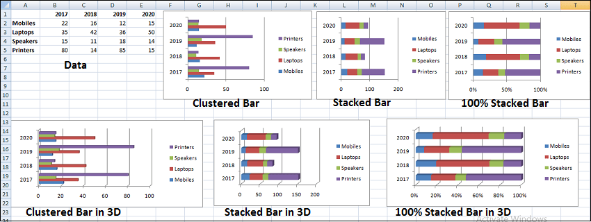
5. Bar Chart
Bar Charts illustrate comparisons among individual items. In a Bar Chart, the categories are organized along the vertical axis, and the values are organized along the horizontal axis.
The main difference between bar charts and column charts is that the bars are horizontal instead of vertical. You can often use bar charts interchangeably with column charts.
However, some prefer column charts when working with negative values because it is easier to visualize negatives vertically on a y-axis.
To create a Bar Chart, arrange the data in columns or rows on the worksheet. A Bar Chart has the following sub-types:
- Clustered Bar
- Stacked Bar
- 100% Stacked Bar
- 3-D Clustered Bar
- 3-D Stacked Bar
- 3-D 100% Stacked Bar
6. Area Chart
Area Charts can be used to plot the change over time and draw attention to the total value across a trend. By showing the sum of the plotted values, an area chart also shows the relationship of parts to a whole. To create an Area Chart, arrange the data in columns or rows on the worksheet. An Area Chart has the following sub-types:
- Area
- Stacked Area
- 100% Stacked Area
- 3-D Area
- 3-D Stacked Area
- 3-D 100% Stacked Area

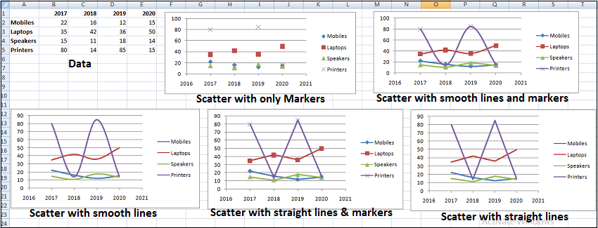
7. XY (Scatter) Chart
XY (Scatter) charts are typically used for showing and comparing numeric values, like scientific, statistical, and engineering data. A Scatter chart has two Value Axes:
- Horizontal (x) Value Axis
- Vertical (y) Value Axis
It combines x and y values into single data points and displays them in irregular intervals or clusters. To create a Scatter chart, arrange the data in columns and rows on the worksheet.
Place the x values in one row or column, and then enter the corresponding y values in the adjacent rows or columns. Consider using a Scatter chart when –
- You want to change the scale of the horizontal axis.
- You want to make that axis a logarithmic scale.
- Values for the horizontal axis are not evenly spaced.
- There are many data points on the horizontal axis.
- You want to adjust the independent axis scales of a scatter chart to reveal more information about data that includes pairs or grouped sets of values.
- You want to show similarities between large sets of data instead of differences between data points.
- You want to compare many data points regardless of the time.
The more data that you include in a scatter chart, the better the comparisons you can make. A Scatter chart has the following sub-types:
- Scatter with only Markers
- Scatter with Smooth Lines and Markers
- Scatter with Smooth Lines
- Scatter with Straight Lines and Markers
- Scatter with Straight Lines
8. Bubble Chart
A Bubble chart is like a Scatter chart with an additional third column to specify the size of the bubbles it shows to represent the data points in the data series. A Bubble chart has the following sub-types:
- Bubble
- Bubble with 3-D effect

9. Stock Chart
As the name implies, stock charts can show fluctuations in stock prices. However, a Stock chart can also show fluctuations in other data, such as daily rainfall or annual temperatures.
To create a Stock chart, arrange the data in columns or rows in a specific order on the worksheet. For example, to create a simple high-low-close Stock chart, arrange your data with High, Low, and Close entered as column headings, in that order. A Stock chart has the following sub-types:
- High-Low-Close
- Open-High-Low-Close
- Volume-High-Low-Close
- Volume-Open-High-Low-Close

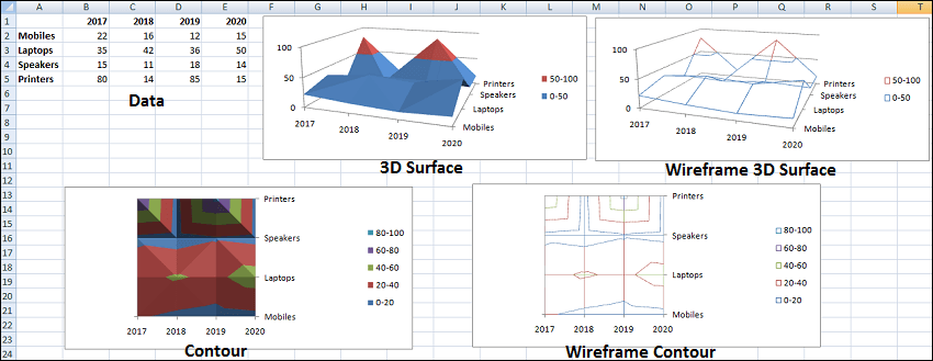
10. Surface Chart
A Surface chart is useful when you want to find the optimum combinations between two sets of data. As in a topographic map, colors and patterns indicate areas in the same range of values.
Creating a Surface chart ensures that both the categories and the data series are numeric values. And arrange the data in columns or rows on the worksheet. A Surface chart has the following sub-types:
- 3-D Surface
- Wireframe 3-D Surface
- Contour
- Wireframe Contour
11. Radar Chart
Radar charts compare the aggregate values of several data series. To create a Radar chart, arrange the data in columns or rows on the worksheet. A Radar chart has the following sub-types:
- Radar
- Radar with Markers
- Filled Radar

12. Combo Chart
Combo charts combine two or more chart types to make the data easy to understand. It is shown with a secondary axis and is even easier to read.
- You can use Combo charts when the numbers in your data vary widely from data series to data series.
- Or you have mixed types of data, such as price and volume.
To create a Combo chart, arrange the data in columns and rows on the worksheet. A Combo chart has the following sub-types:
- Clustered Column – Line
- Clustered Column – Line on Secondary Axis
- Stacked Area – Clustered Column
- Custom Combination
Download the above Excel Charts Example File
Important Points to Create Excel Charts
Excel provides several layouts and formatting preset to enhance the look and readability of the chart. Below are some important points to make your chart or graph clear, effective, and easy to understand:
- Make it clean: Some charts with excessive colors or texts can be difficult to read and isn’t eye-catching. Remove any unnecessary information so your viewers can focus on the point you’re trying to get across.
- Choose appropriate themes: Consider your viewers, the topic, and the main point of your chart when selecting a theme. Choose the theme that best fits your purpose.
- Use text wisely: While charts and graphs are primarily visual tools, you will likely include some text such as titles or axis labels. Be concise but use descriptive language, and be intentional about the orientation of any text.
- Place elements intelligently: Pay attention to where you place titles, legends, symbols, and other graphical elements. They should enhance your chart, not detract from it.
- Sort data before creating the chart: People often forget to sort data or remove duplicates before creating the chart, making the visual unintuitive and can result in errors.


