
Waterfall Chart Excel
MS Excel or Microsoft Excel is currently the most popular spreadsheet software program with many built-in features and functions. When it comes to the visualization of data in the spreadsheet, Excel is a clear winner compared to other spreadsheet programs in the market. Excel supports several chart types, and the waterfall chart is one of the great options for visualizing the data via charts.

In this article, we elaborate on an introduction or definition of the Excel Waterfall Chart. The article also discusses step by step tutorials on how to create these charts in Excel sheets, including relevant examples.
What is a Waterfall Chart in Excel?
The waterfall chart is a special type of Excel chart that mainly helps display the supplied data series’s beginning and ending position as per the change over time, either increasing or decreasing. In a waterfall chart, the first column usually represents the first value of the data series, while the last column represents the last value. However, all the columns together represent the whole value. Values are reflected positively and negatively using different colours, showing how the value increases or decreases through a series of changes.
Sometimes, the waterfall charts use different lines between columns in the plot area, which display a chart similar to a bridge. That is why it is also known as the Bridge Chart/Graph.
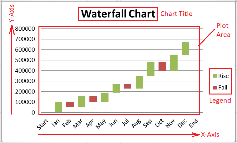
Components of Waterfall Chart
There are five main components of the Excel Waterfall Charts, such as:
- Plot Area: The plot area is where the supplied data is illustrated graphically in a chart.
- Vertical Axis: Vertical Axis helps plot the measurement values in the X-axis. So, it is also termed the X-axis.
- Horizontal Axis: Horizontal Axis helps plot categories of data in the Y-axis. The horizontal axis is also termed the Y-axis, and the series data can be combined on this axis as desired.
- Chart Title: Chart title is the main subject or topic that helps understand the main motive of the plotted chart. A chart title and its position can be edited as desired.
- Legend: The legend is a useful element of the chart, which typically helps in listing and differentiating different data groups. It can be moved to any desired side of the Chart/ Plot Area, such as left, right, top and bottom.
Uses of Waterfall Chart
The waterfall charts got popular in the late 20th century when McKinsey and Company used this chart type for presenting their data. Initially, the waterfall charts were mainly used to track monetary statistics and performance. However, they have become useful in different financial tasks over time, and more and more companies are using these charts to represent data to their clients/ readers.
Nowadays, the waterfall charts are seen in most cases, from visualizing the data to navigating vast amounts of census data. Some essential uses of the waterfall charts can be seen in the following scenarios:
- Evaluating overall profits in a specific period
- Comparing earnings through different products on the company
- Highlighting budget changes of projects
- Visualizing profits/ loss statements.
- Creating executives’ dashboards
- Displaying products value over time
- Analyzing inventory or sales over time
- Keeping track of retail inventory
- Contrasting Competitors
- Analyzing how operating costs have changed from a one-time cycle with others
There are many other uses of the waterfall charts in Excel. These charts have been adopted by several departments and sectors, especially by sales companies, e-commerce companies, construction companies, retailers, educators, legal departments, lawyers, etc.
Important Features of Waterfall Chart
Generally, each waterfall chart looks different from the other one because of the supplied set of data. However, they all have some common features, such as:
Floating Columns: The waterfall chart consists of floating columns. Floating columns usually exhibit both positive and negative changes according to the initial values. It mainly helps to display a quick view of price positions over time.
Spacers: The waterfall charts do not always represent columns beginning from zero. Instead, they use spacers or padding and adjust columns offset by certain margins.
Connector Lines: Waterfall charts use connector lines (called datums) that help represent relationships between floating columns. Although connector lines are not needed for all waterfall charts, they can help enhance our chart’s professional look and overall representation.
Colour Coding: Excel allows colour coding for specific floating columns. Using multiple colours in different columns, we can show positives from negative values and quickly view movement over time.
Crossover: There can be many scenarios in waterfall charts, based on the supplied values we plot in a chart, where the values will shift across the x-axis. It is one of the essential features of a waterfall chart, as the chart must automatically adjust to reflect motion across the axis.
How to create a Waterfall Chart in Excel?
When it comes to using the waterfall charts in Excel, there are two different methods depending on the excel version we have. In Excel 2016 and higher versions, there is an inbuilt tool for a waterfall chart type within the Charts section. Unfortunately, there is no built-in option for a waterfall chart in Excel before Excel 2016. Using Excel 2013 or any lower version, we will have to add some additional data and create a waterfall chart manually using the customized stacked column chart.
Let us understand the process of creating/inserting waterfall charts in both old and new versions of Excel:
Creating Waterfall Charts in Excel 2016 and Higher Versions
The following are the steps to create a waterfall chart in Excel:
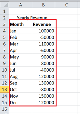
- First, we need to enter data in an Excel sheet to create a corresponding waterfall chart. We need to select the effective data or a data range, as shown below:
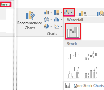
- Next, we need to go to the Insert tab and click the Waterfall Chart icon under the Charts
After we click the Waterfall Chart icon, Excel will display some different charts under different categories. To create a waterfall chart, we need to select the tile under the section named Waterfall, as shown below:
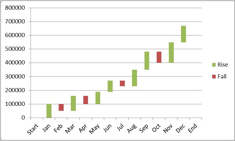
- As soon as we click the waterfall chart tile from the window, the corresponding chart will be instantly inserted within the active sheet in no time. The waterfall chart for our example data set will look like this:

That is how we can easily insert a waterfall chart in Excel 2016 and higher versions, and it is typically a two-clicks process.
Creating Waterfall Charts in Excel 2013 and Lower Versions
Creating waterfall charts in Excel 2013 and lower versions is a somewhat long and time-consuming process, and it requires multiple steps to create a waterfall chart in Excel 2013 and lower versions.
Let us take the same example as above and understand the step by step process of creating the corresponding waterfall chart in Excel 2013 and lower versions:

Step 1: Rearrange the Data
First, we need to rearrange our excel sheet to create a waterfall chart in Excel 2010 and lower versions. We have to insert three new columns in between our example data columns, and we name them Base, Fall and Rise, as shown below:

In the above image, the Base column (Column B) will contain a calculated amount as an initial point or value for the other two columns, Fall and Rise. The Fall column (Column C) will contain all the negative values of the Revenue flow, while the Rise column (Column D) will contain the positive values. Next, we insert the Start row at the beginning of the table. We also insert the End row after the most bottom (last) row of our data. This row mainly helps to analyze the revenue values throughout the entire year.
Step 2: Insert Formulae
After arranging the data, we need to enter specific formulas in the first cells or corresponding columns and drag them down to the entire column using the fill handle. Alternately, we can copy-paste the formula in corresponding adjacent cells. But, first, we need to enter zero in all the cells of the Start row.
- We enter the formula “=IF(E4<=0, -E4, 0)” without quotes in all the cells of the Fall column. According to the formula, if the value in a cell is less or equal to zero, display the negative value as positive and vice-versa.

- We enter the formula “=IF(E4>0, E4, 0)” without quotes in all the cells of the Rise column. According to the formula, if the value in a cell is greater than zero, display the positive values as they are, but display negative values as zero.
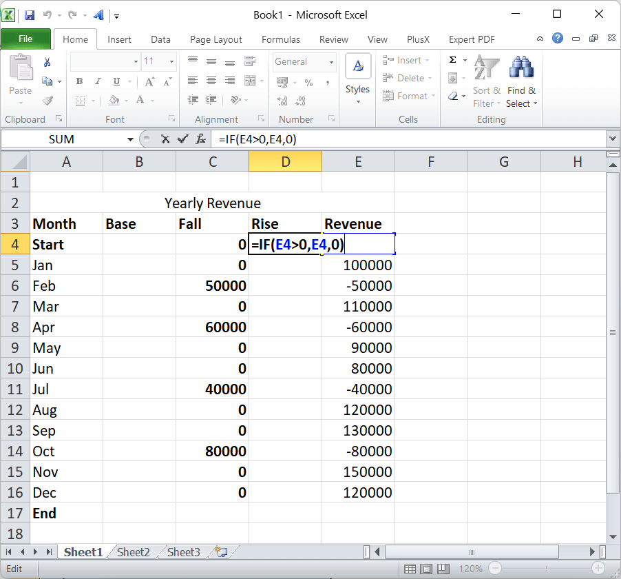
- We enter the formula “B4 + D4 -C5” without quotes for all the cells of the Base column from the first-month row till the End row.

After that, our data will look like this:

Step 3: Insert a standard Stacked Column Chart
After getting all the data values, we need to insert the standard stacked chart with the corresponding data.
- First, we select the data with the respective header, but without the revenue column, as shown below:

- After selecting the data, we need to navigate to Insert > Charts > Stacked Charts and select the second tile under the Stacked Column Chart in Excel. It looks like this:

- After we select the chart, the same will be instantly inserted into the sheet. However, it doesn’t look like the waterfall chart because it isn’t the waterfall chart. The inserted chart looks like this:

We need to follow some other steps to convert this stacked column chart into an Excel waterfall chart.
Step 4: Transform the Stacked Column Chart into Waterfall Chart
To transform the created stacked column chart into the waterfall chart, we must make the Base series data invisible. For this, we must perform the following steps:
- We need to press the mouse right-click button with the Base data selected in an inserted chart. Next, we need to select the option ‘Format Data Series‘, as shown below:

- To make the Base series data invisible, we must change the settings. We need to select the ‘No fill‘ option for the Fill section and the ‘No line‘ option for the Border Colour section.

- Once the Base series data is hidden from the plot area of the stacked column chart, it becomes the waterfall chart. Our example data creates the following waterfall chart:
Once the chart has been inserted, we can customize and add/remove elements accordingly.
Step 5: Format Excel Bridge Chart (Waterfall Chart)
Once the chart has been inserted into the sheet, we must change chart elements to make it attractive and informative. For example, we can edit the chart title, add colours, change the width of columns, add labels, etc.
However, step 5 is the optional step.
Add-ins/ Extensions for creating Waterfall Charts in Excel 2013 and Lower Versions
As we have discussed above, the process of creating waterfall charts in Excel 2013 and lower versions is quite difficult and time-consuming as compared to current versions of MS Excel. But, if we don’t want to mess around the data and insert a waterfall chart at a click in Excel 2013 and lower versions, we can use specific special Excel add-ins or plugins. Some add-ins can help add waterfall charts in Excel 2013 and lower versions similar to Excel 2016 and above.
Most of the add-in tools for waterfall charts are paid. For example, Peltier Tech Chart Utility, Think-cell Chart, AnyChart, Aploris, etc. However, we can try the PlusX Excel add-in. It is free to use and can be download from their official site here:
Link: http://plusx.me/01en/index.htm
We can go through the ‘Downloads‘ section and download the relevant add-in as per the Excel version that we are currently using.

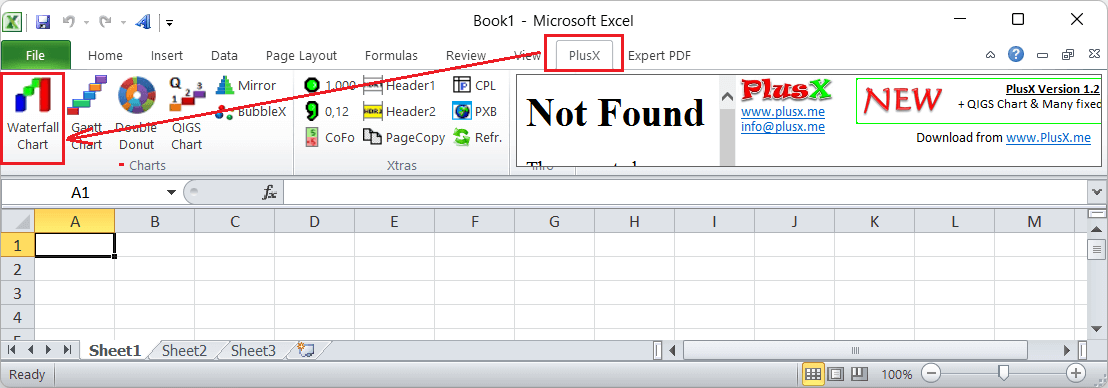
After downloading the add-in, we need to install it like any other typical software. Once the add-in has been installed, we will see a new tab named PlusX on the Excel ribbon. Whenever we want to insert a waterfall chart, we have to select the data and click on the PlusX tab, select the tool ‘Waterfall chart‘, as shown below:
We can easily insert a waterfall chart in Excel 2013 and lower versions upon clicking the Waterfall Chart option. After that, inserting a waterfall chart is similar to inserting a waterfall chart in Excel 2016 and higher versions.
Customizing the Waterfall Chart in Excel
Excel Charts can be customized or edited using different methods. The process for customizing the waterfall chart is almost identical to customizing other charts available in Excel. The following are some typical methods to customize Waterfall Charts in Excel:
Double-Clicking
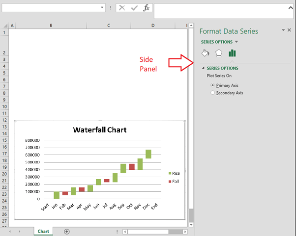
The common method to customize charts and their elements in Excel is to use double-clicks. As soon as we double-click on any element of the inserted chart, Excel displays additional editing or customization options relevant to the selected element. In Excel 2010 and lower versions, the additional options are displayed within the pop-up window. But, in Excel 2013 and higher versions, the corresponding options are displayed in a right-side panel, as shown below:
If we want to edit another element of the chart, we don’t need to double-click again. Instead, we can select the chart element and activate relevant editing options. The side panel consists of element-specific customization options and formatting features, such as changing colours and effects.
Right-Click (Context) Menu
Accessing the right-click menu using the mouse is a quite common task in Excel, and it also consists of several customizations or formatting options. We must use the right-click on specific chart elements or even the chart itself to access relevant options. The context menu (right-click or contextual menu) lists down some quick options for basic customizations like changing colours and other formattings.
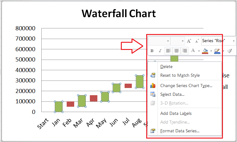
We can also access the detailed side-panel customization or pop-up window using the context menu. For this, we need to choose an option that starts with the text ‘Format’. However, we must select the desired element before accessing the context menu or pressing the right-click button. For example, the image above shows the ‘Format Data Series’ option when selecting and right-clicking a data series in a chart.
Chart Shortcuts
Chart Shortcuts section is another great option to edit chart elements, formatting and filtering. It is only available in Excel 2013 and higher versions. By default, it is situated on the top-right side of the plotted chart in Excel. The Chart Shortcuts section consists of quick toggle checkboxes to turn specific chart elements on or off. Using the checkboxes, we can insert or remove desired chart elements.

The primary advantage of using the Chart Shortcuts section is that it displays the preview of options when we hover onto the checkboxes or the options. In the above image, we only move a cursor on the Chart Title > Above Chart, and the title preview is displayed on top of the plot area in the chart even before applying it.
Ribbon
The Ribbon is the most basic area that includes all the options present in Excel. Once we have inserted a chart in a sheet, we will see some new tabs on Ribbon relevant to the inserted chart. The tabs provide options for advanced editing and customization in the inserted chart. The tabs, namely DESIGN and FORMAT, are displayed under the category Chart Tools. In Excel 2010 and earlier, we also get an additional tab named LAYOUT.
The Design tab contains options such as inserting chart elements, colours, styles, quick layouts, and other editing options. In contrast, the FORMAT tab includes special formatting options that remain common with several other objects in the chart. Additionally, the LAYOUT tab has advanced options for editing layouts and their elements.

Note: It is important to note here that we will be editing or customizing the Waterfall chart and its elements in Excel 2016 and higher versions. But, in Excel 2013 and lower versions, we will customize the Stacked Column chart and its elements as an alternative to the Waterfall chart.
Advantages of using Waterfall Chart
The following are some advantages of using the waterfall charts in Excel:
- The customization in waterfall charts is easy, and the appearance is much attractive than other charts in Excel.
- The waterfall charts can be made simple with basic customization and complex with heavy customization and features depending on the requirements.
- The waterfall charts help showcase the different data sets, from the inventory analysis to the performance analysis or sales.
- We can break down the cumulative effects through the positive and negative contributions of data, presenting how we have come to the resultant value.
- The waterfall charts are best suited for analytical purposes, especially to showcase the change in values over time. Furthermore, they help display gradual changes in the value of a specific product.
Disadvantages of using Waterfall Chart
The following are some disadvantages of using the waterfall charts in Excel:
- Creating waterfall charts in Excel 2013 and lower versions take too much effort, and the process is time-consuming. Additionally, the chart lacks the variety of features and options for versions before Excel 2016.
- The waterfall charts have limited features in Excel as compared to other charts.
- The waterfall charts can be difficult for readers who don’t have basic knowledge of Excel charts.


