
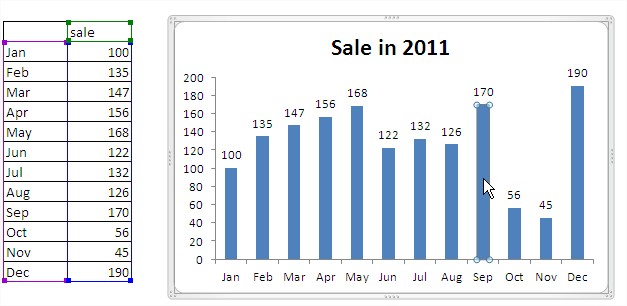
Column Chart in Excel
 Chart, which will be added to the sheet can drag to the desired location by clicking with the left mouse button and while holding this key down while dragging.

We can also resize the chart by dragging any corner or agent of any of the sides (corners and sides of the resources are marked by dots). Standard Excel adds grid lines (horizontal black lines in the figure above), you can delete them by clicking on it (picture below) and pressing the button on the keyboard ‘Delete’.
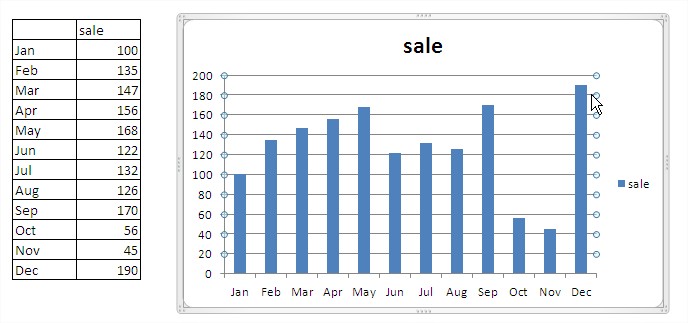
In our case, the legend (blue box and the inscription sale) is completely unnecessary because the chart is only one category of data is described in the title. To delete it, click on the left button once, it will select it and hit ‘delete’.
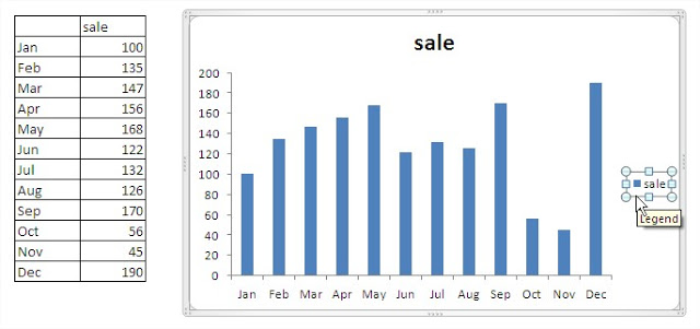
Chart plot area (the area with blue bars) will automatically extend to filling the position vacated by the legend.

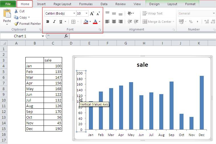
The next step will be formatting the axes. After selecting the axis (single left mouse click), we can change the font of labels, size and format using the icons on the ‘Home’. The same applies to the other chart elements – the legend, title, labels, etc.
By clicking on the axis of the right mouse button and selecting ‘Format axes …’ we get access to more options.

In the ‘Format Axis’, which is displayed on the “Axis Options” for example, we can change the minimum – the value of which begins with the Y axis chart below is shown that to do so must first click the ‘constant’ and then enter for example . 200th We can also change the main unit, eg from 100 to 200 if we consider that the labels on the axis is too much. After checking how these options propose to return to automatic settings by clicking the ‘Auto’. On the other tabs of the ‘Format Axis’ find many text formatting options, some of them will be discussed in subsequent examples, the function of other easy to guess from their name.

Change the format of the horizontal axis, the axis X. On the ‘Alignment’ dialog ‘Format Axis’, we can determine the position of the text, we determine them to the horizontal and hit ‘OK’ button.

Let us set the parameter ‘angle of custom:’ to zero. The easiest way to click once located at the up arrow and down arrow once.

Next steps will be: – Improving the chart title – Adding data labels to the values – Add trend line. Changing the title is 2 single clicks on it and entering the correct title.

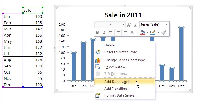
To add data labels right click on any column and choose ‘Add data labels’
When you click the left mouse button on any of the labels, we can format all the labels using the commands available on the ‘Home’.

Two single-click in the selected labels will allow us to format only the one selected label. It is used to draw attention to the person who will be watching our chart on our elected post. I propose to enlarge the font and add a bold effect.

Exactly in the same way we can change the color of all bars (one click, and select a new color) or only one of the selected bar (two single-click and select a new color).
I propose to change the color bar with the data for October on the blue lighter. When choosing colors, avoid saturated colors and contrast connections.

To add a trendline click on the column again right-click and choose ‘Add trendline … “.

Window appears ‘trend line Formatting’ tab ‘Options trend line’ to select the type of trend. For many types of data, especially those of comparable (eg sales in subsequent years) will be the best linear trend. In our example, the more we want to determine sales profile (seasonality), so we use the 6 degree polynomial trend.
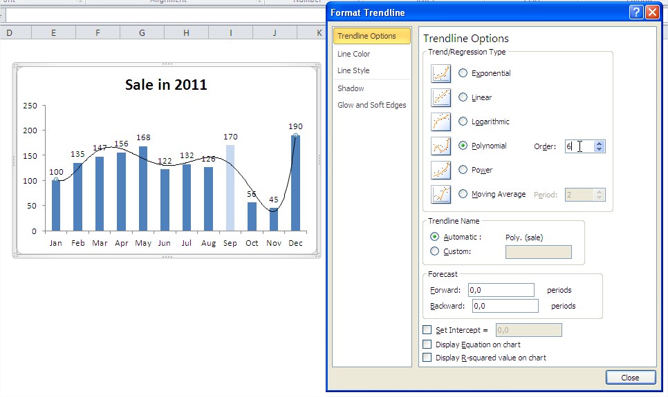
Before you click ‘Close’ even change the width and type of trend line. These options can be found on the ‘Line Style’.

As a result of the above changes to get the chart, which should look like below.

Example 2 Advanced Column Chart
To get the best possible way to show data in the table below for a chart, use chart on 2 axes. We’ll start by selecting a table with headers. A common mistake is to select the amount of data, the chart contains the total will be unreadable because the other bars are too small to be able to properly assess the differences between them. The cards ‘Insert’ choose plot ‘Column’ and its first subtype (clustered column).
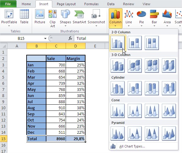
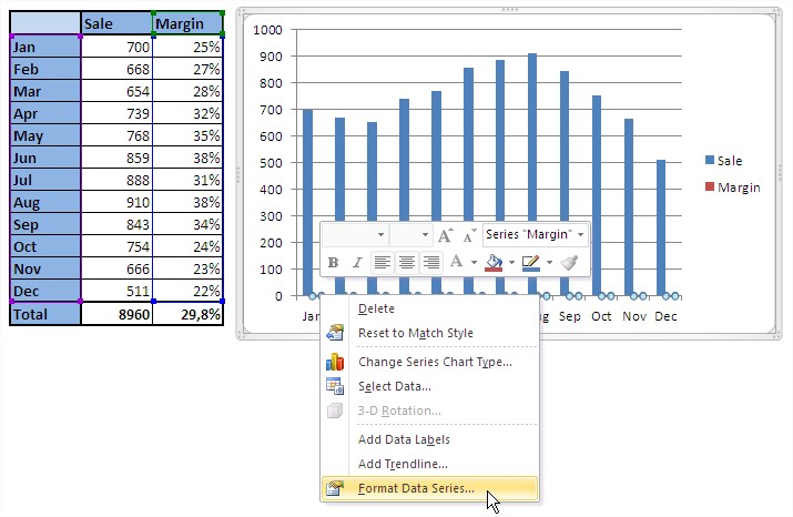
Chart prepared by Excel automatically will be far from what we want to achieve. Margin percentage is shown on the same axis as the sales and posts of it coincide with the axis X. When you move the mouse pointer column margin, which requires precision and patience sometimes, the message shown in the figure below.

Click any column margin of the right mouse button and choose the command ‘Format Data Series…’.
In the ‘Format Data Series’, on the ‘Options series of’ change ‘main axis’ to ‘axis of auxiliary’ and click ‘Close’ button.
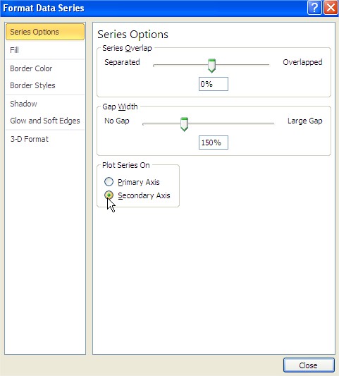
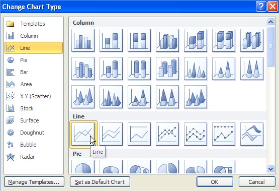
The effect of this change is not impressive, there was a second Y axis on the right side of the chart, but the stakes stakes Sales margin cover. Click any of the bars margin, right-click and go to ‘Change the chart type serial …’.

Change the type to ‘Linear’ and the first of its subtypes ‘Linear’, then click OK.
Finally, the graph that we obtained is close to that as it is to look like. Let’s delete now the major grid lines. After these changes, the chart will look like the picture below.

Left only to add a chart title. After selecting the chart on the ‘Layout’ click on the ‘Chart Title’ and select ‘Centered overlay title’.

After the string ‘Chart Title’ appears on the chart, click on it and enter “Sale and Margin 2011′.
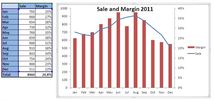
By right clicking on the title can change the font size, I suggest to select the 14th.

Legend looks better on the bottom. Right click on the legend, choose Format legend and click Bottom.

The chart can be considered finished.

Template
Further reading:
Basic concepts
Getting started with Excel
Cell References


