How to make pie charts in excel
Pie chart is a graphical way to represent the data in Excel. Excel offers various pie charts. The Excel user can use any of these whatever they want to represent their data. Thus, the data becomes more understandable and easier to get. You can get the pie charts inside the Insert tab.
By using the pie chart representation, data growth can be easily understood. Basically, pie charts display the contribution of each value (each cell data) to a total data (pie). In this chapter, we will describe the method to add a pie chart to your Excel worksheet.
Types of pie charts
Excel usually offers two types of pie charts along with the Doughnut pie chart.
- 2D pie chart
- 3D pie chart
The user can use either 2D or 3D pie chart, whichever he/she wants. Pie charts are used to show the proportion (share) of a whole.
What a pie chart contains?
A pie chart usually contains three components: chart title, graph, and legend entries. Each component indicates to a part of a pie chart and three of them equally useful. By seeing the chart only with these three informations, you can analyze the data.
Chart title
Chart title contains the title for the pie chart, which defines the purpose of the chart. You can provide the chart title according to your chart containing information.
Graph
A graph is a pie chart containing pieces of slides to display information through pictorial representation. Each slice piece is colored with a specific color to represent the data.
Legends Entry
The legend entries refer to the column selected to represent the information through a pie chart.
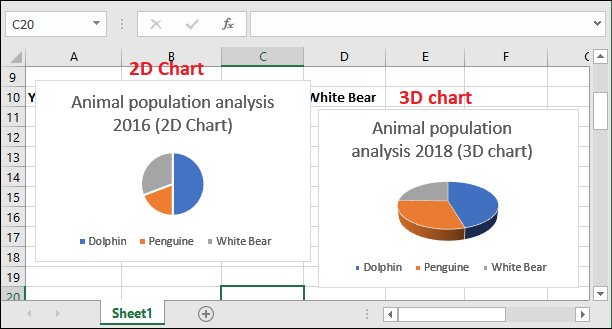
Let’s see how the pie chart looks –

It is an example of a 2D pie chart containing the animal population report of year 2018. Here, Blue color is indicating to Dolphin, Orange for Penguin, and grey for White bear.
Add a 2D pie chart
Adding a pie chart with your Excel data, make the data more recognizable. With a few simple steps, you can add the pie charts with respect to your data. In this example, we will add a 2D pie chart to an Excel worksheet for the data.
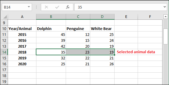
Step 1: We have a small record of three animals (Dolphin, Penguin, and White Bear) population for each year. We will show you the steps to add the pie chart for this record of data.

Step 2: Firstly, select a year record, e.g., 2016, for all three animals with Shift and arrow key.

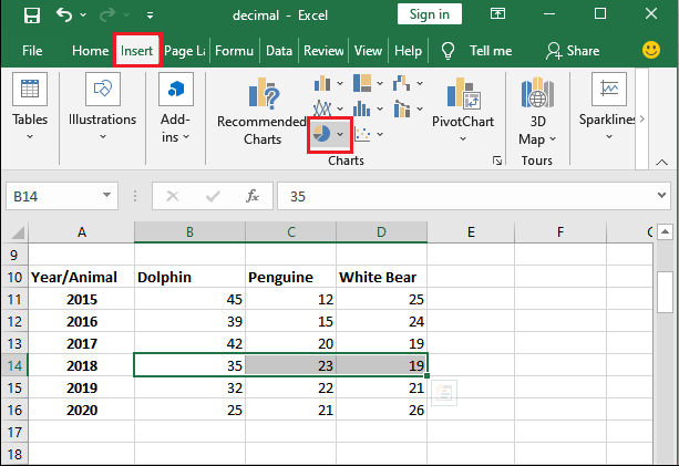
Step 3: Go to the Insert tab inside the menu bar and navigate to the Insert Pie and Doughnut charts option (in the charts section).
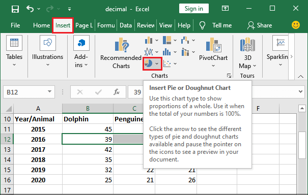
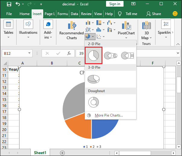
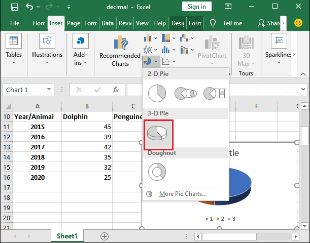
Step 4: Click on the Pie chart and you will see 2D, 3D pie charts, and Doughnut charts here. Select one from any of three 2D charts to add it to your Excel sheet.
We have chosen the first one.
Step 5: You can edit the title of the chart from here by enabling the Chart title on click. Then, give a new title according to chart data.
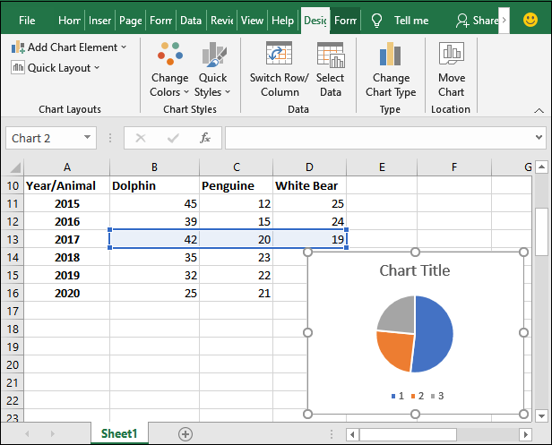
Note: A Design tab will automatically add to the Excel menu bar once the chart is added to the Excel.
Single tap on Chart Title to edit the text, remove the title.

Give a new title inside the chart title.

Change the legend entry name in pie chart
You see the legend entry named as 1, 2, 3 with a specific color blue, orange, and grey, respectively. You can change them according to your pie chart data by giving your own. These legend entries indicate one of the values.
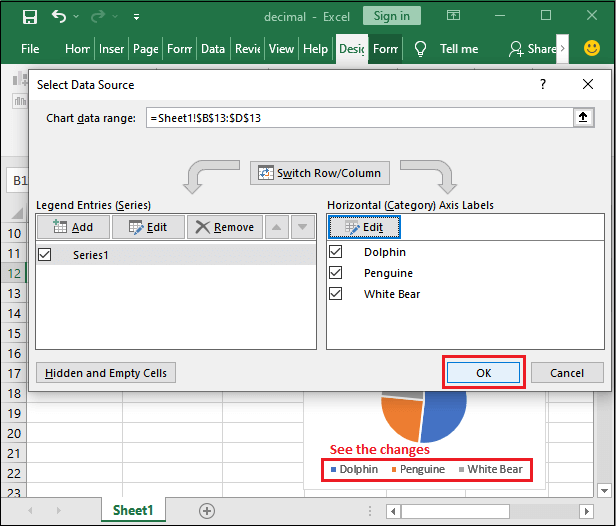
Step 6: Select the pie chart you have added and navigate to the Design tab, where you will see a Select Data option.

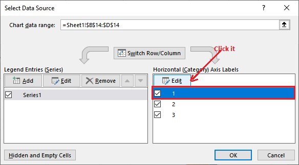
Step 7: Click on this Select Data option, which will show a Select data source panel. At the right side of this panel (Horizontal Axis Labels), you will see the entry as named 1, 2, 3.

Step 8: Firstly, select the legend entry whose name you would like to modify and click on the Edit button.
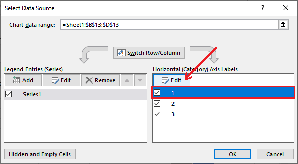
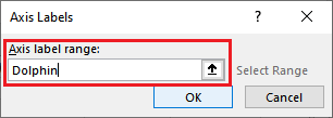
Step 9: Provide a new name inside the Axis Label range and hit the OK button.
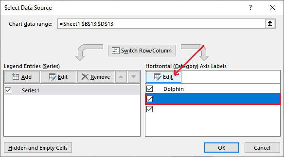
Step 10: The label name will immediately change and reflect on the pie, as shown in the below screenshot.

Step 11: Now, again select the next legend entry row and click on the Edit button to add more legend entry names.
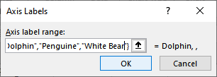
Step 12: You will see the previous entry in double inverted commas inside the curly brackets.

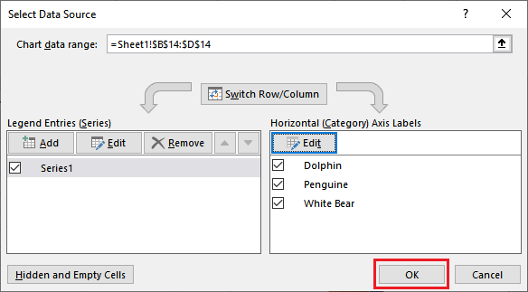
Step 13: Provide the other column names to the pie chart’s legend entry and click the OK button.
={“Dolphin”,”Penguine”,”White Bear”}
Step 14: Click on the OK button in the Select Data Source panel to keep and save the changes.
Step 14: See the pie chart after legends entry names get changed.

Note: You can add more entries by clicking on the Edit button and remove the existing one by unmarking it.
You can also change the colors of the pie charts.
Why use pie chart in Excel?
- Pie charts help to show a lot of information through a chart at once. Charts are great ways to show the value in graphical view.
- It helps to analyze the data fast. Thus, the immediate analysis of data makes the comparison easy and fast.
- Besides the pie charts, some charts include complex and complicated information. So, it requires little extra explanation of charts and data.
- There are different type of pie charts, like – 2D or 3D in Excel, which enables different visual effects.
Add a 3D pie chart
Now, we will give an example to add a 3D pie chart to an Excel worksheet for the data. The steps for adding 3D pie charts are almost the same as the 2D chart.
Step 1: We have the same table record of three animals (Dolphin, Penguin, and White Bear) population for each year. On this record, we will add a 3D pie chart.
Step 2: Select any year of all three animals record, e.g., 2018. Please do not include the year cell in it.
Step 3: Go to the Insert tab inside the menu bar and navigate to the Insert Pie and Doughnut charts option (in the charts section).
Step 4: Here, click on the 3D chart to add it to your Excel sheet.
A chart in 3D shape has been added to your Excel worksheet. Now, customize the chart title and legend entries accordingly.
Step 5: Change the title of the chart and provide a new one.

Now, edit the names of legend entries from the newly added Design tab.
Step 6: For this, select the legend entry and click on the Select Data inside the Design tab.

Step 7: Select the first legend entry (1) here and click on the Edit button.
Step 8: Provide all three animal’s data inside the Axis label Name field and click the OK button.
={“Dolphin”,”Penguine”,”White Bear”}
Step 9: See that all three legend entries have been added. Click the OK button to save the changes.
Step 10: 3D customize pie chart has been added to the Excel sheet for the year 2018 data.

2D or 3D pie chart
See how differently 2D and 3D pie charts in structure.