
How to Create a Dashboard in Excel?
An Excel dashboard is a place where you could track all your business’s essential indicators, KPIs, metrics, and other data points in one visual, central position.
Dashboards give you a high-level view of work, making quick decisions and keeping everyone up to date.
A dashboard is a visual representation of complex data and provides an at-a-glance view of current status or performance in real-time. Dashboards are made up of tables, charts, gauges, and numbers. They can be used in any industry for any purpose.
Dashboards are often confused with reports. A dashboard can be a report, but not all reports are dashboards. Below is the major difference between report and dashboard:
- A report would only collect and show data in a single place. For example, if a manager wants to know how the sales have grown over the last period and which region was the most profitable, a report would not answer it. It would a simple report of all the relevant sales data. These reports are then used to create dashboards that will aid in decision-making.
- A dashboard would instantly answer important questions such as which regions perform better and which products the management should focus on. These dashboards could be static or interactive, where the user can make selections and change views, and the data would dynamically update.
Types of Dashboards
There are three common types of dashboards in Excel, such as:
1. Strategic Dashboards: A strategic dashboard is a reporting tool used to monitor the status of key performance indicators (KPIs) and is typically used by executives. The data behind a strategic dashboard update regularly but at less frequent intervals than an operational dashboard.
Strategic dashboards may be viewed once a day and help executives stay on top of KPIs throughout the business.
2. Analytical Dashboards: An analytical dashboard is a reporting tool used to analyze large volumes of data to allow users to investigate trends, predict outcomes, and discover insights.
Analytical dashboards are more common within business intelligence tools because they are typically developed and designed by data analysts. The data behind an analytical dashboard needs to be accurate and up-to-date and may only be updated infrequently.
Analytical dashboards often include advanced BI features like drill-down and ad-hoc querying.
3. Operational Dashboards: An operational dashboard is a reporting tool used to monitor business processes that frequently change and track the current performance of key metrics and KPIs.
Compared to other types of dashboards, the data updates very frequently, sometimes even on a minute-by-minute basis.
Operational dashboards are designed to be viewed multiple times throughout the day. They are often used to monitor progress towards a target.
Things to Do before Create a Dashboard
Creating an Excel Dashboard is a multi-step process, and there are some things you need to follow when creating it. Even in Excel, you need to be clear about the objectives of the dashboard. There are some points that you have to define before creating a dashboard, such as:
1. What is the purpose of creating the dashboard?
Clarify your reason for creating a dashboard. Is it to prove a point? Show the overall status of the operation? Or measure the performance of the business?
2. What key performance indicators or metrics should you track to fulfill the purpose of your dashboard?
To make your dashboard more effective, you have to highlight only the necessary data. Including data that’s not important will only service to distract anyone who’s using the dashboard.
3. Who will use the Excel dashboard?Is the dashboard for yourself, manager, vendor, executive, or an analyst? You need to structure the data and tailor the dashboard for the person who will be using the dashboard.
4. After that, you would also benefit from outlining your dashboard structure. Suppose you create a skeleton map of your dashboard and identify what KPI chart or visual to put and where.
5. Lastly, consider converting your raw data into an Excel table. This allows you to instantly update the table with new information and even filter or reformat them in a few clicks.
How to Create a Dashboard?
Below is the step by step processor to create a dashboard in Excel:
Step 1: Get your data into Excel.
First, you have to import your data into Excel. You can directly copy and paste the data, or by using CommCare, you can create an Excel Connection to your export.
The best way is to use ODBC (or Live Data Connector). It can connect your apps to Excel, passing real-time data from your app to Excel. As data is updated in your app, your Excel dashboard will also be updated to reflect the latest information.
Then, set up an Excel table with the raw data on another tab. With an Excel table, you will be able to name your rows, columns, and cells. This makes referencing easier later on.
Step 2: Set up your dashboard tab
Once you have added your data, you need to structure your workbook.
- Open a new Excel Workbook and create two to three sheets.
- You could have one sheet for your dashboard, one sheet for the table, and one sheet for the raw data (you can hide the raw data).
This will keep your Excel workbook organized.
In the below example, we have three tabs and place the dashboard as the first tab for easy access.

Step 3: Create a table with raw data
In the Raw Data sheet, import or copy and paste your data. Make sure the information is in a tabular format. This means that each item or data point lives in one cell.
In the below example, we add columns such as Project Name, Start Date, End Date, Duration, and Budget.

Step 4: Analyze the Data
Before building the dashboard, take some time to look at your data and figure out what you want to highlight on your dashboard. Do you need to display all the information? What kind of story are you trying to communicate? Do you need to add or remove any data?
Once you have to analyze your data to reflect your purpose, after that you will need to use different Excel features and functions such as:
- Excel formulas like SUMIF, OFFSET, COUNT, VLOOKUP, GETPIVOTDATA, and others
- Pivot tables
- Excel tables
- Data validation
- Auto-shapes
- Named ranges
- Conditional formatting
- Charts
- Excel dashboard widgets
- Macros
Figure out the purpose of your dashboard first and see what tools (features and functions) you need to use to analyze the data.
You don’t need to know how to use every single one of these Excel tools. With some basic knowledge of charts and pivot tables, you can easily make an Excel dashboard.
Step 5: Create the dashboard
This step could be summarized by simply inserting the charts and visuals you need on your dashboard.

The final result is a spreadsheet with different visuals that would tell a story about your data and fulfill your dashboard’s purpose.
Consider using the new charts in Excel that were released as part of Excel 2016. You could also use a Gantt chart if there’s a timeline involved. Or maybe you can use a chart as simple as a bar graph.
To Add a Chart
We’ll add a chart to show your project timeline visually.
Step 1: Go to your Dashboard sheet and click on the Insert tab.
Step 2: In the Charts section, click the bar chart icon and select the second option.
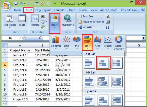
Step 3: Now, you’ll have to link this bar chart to the Project Name Start Date, and End Date columns in your Raw Datasheet.

To Change Charts Format
Step 1: In your Dashboard sheet, click Insert and select the kind of chart you’d like to make.
Step 2: Right-click on the chart and click Select Data.
Step 3: Click Add in Legend Entries (Series).
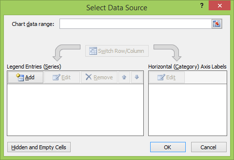
Step 4: In the Series name field, click the title of the column you want to add on the Raw Data sheet and press enter.
Step 5: In the Series values field, select all the data in that corresponding column. Press enter and then click the Ok button.

If your X-axis is not correctly labeled, then to fix this, click Edit in the Horizontal (Category) Axis Labels and the Raw Data Sheet, select what you’d like to display on the X-axis.
Step 6: Repeat this process for any other charts you want to create.
Now your dashboard sheet having all your created charts, and something looks like below:
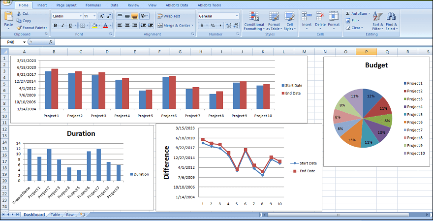
You can also add customization to your visuals to reflect your brand. You can always change the chart colors, fonts, and even a little Macro to add style to your dashboard.
To Create a Dynamic Chart
If you want to add interactivity to your dashboard, you have a couple of different options.
1. Drop-down list or data validation list: If you have advanced knowledge of Excel and understand VLOOKUP and formulas, you can use a drop-down list, also known as a data validation list, to create interactive charts.
With this drop-down list, viewers can select the criteria they want to filter on, and the chart will automatically change to reflect those criteria.
2. Macros: You can write a Macro using Excel’s coding language called Visual Basic to automate a task.
Instead of manually sifting through a lot of data and moving data to different sheets, a Macro can automate the process for you. You can also use Macros to create a button on your dashboard.
When you click that button and select specific criteria, all the charts will automatically change to represent those particular criteria.
3. Slicers: If you want to add another layer of filtering to your pivot table, you can use slicers. Slicers are visual filters, and with just one click, you can filter the pivot table report.
Slicers contain a set of buttons that filter the data and show which filter you are viewing. You can use these slicers to create an interactive chart. Set up a pivot table and add a slicer for specific filter/criteria.
Create a chart from the pivot table and move the slicer next to the chart. Now, when you select different buttons on your slicer, your chart will change dynamically.
Dos and Don’ts
Although some of the recommendations below vary from project to project, these usually apply to most types of dashboards. Here are things to remember about creating an Excel dashboard:
- Avoid using volatile functions on your workbook such as ‘NOW’, ‘TODAY’, and ‘OFFSET’ as these will slow down the calculations.
- Keep your dashboard easy-to-understand and straightforward. It may be tempting to add impressive effects and graphics, but doing so might make your dashboard difficult to understand.
- Avoid inserting unnecessary visuals on your dashboard. They will add space and will only make your dashboard look complicated.
- Use Freeze Panes so the user of your dashboard will be able to navigate it more easily. You can free the rows or even the headings so they will always be visible to the user.
- Create a user guide for your dashboard or add shapes or numbers, so the user will know which visual to look at first.
- Use different tabs to keep your dashboard organized by using different sheets for different things. For example, one tab will hold the dashboard itself, and another tab will store the raw data that populates the dashboard.
- Add alerts for important information to highlight a particular aspect of your dashboard or quickly convey status. Add alerts or red, yellow, green balls. You can use these traffic light symbols with conditional formatting, so they automatically update based on the values in your table.


