Difference chart
 2. The column that had been left blank, enter the heading difference. And use the following method to calculate values of that column (High – low column).

3. Once the value of the first cell of difference column is calculated, drag it down till week 5. You will get:

4. Select the first three columns. Then, Click insert> insert bar chart> Stacked bar chart.
5. Now, right click on the blue part of the chart and click format data series. A box will appear on the screen.
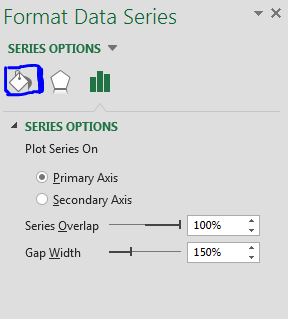
6. Click on the fill and line (marked with blue) in the following screenshot:

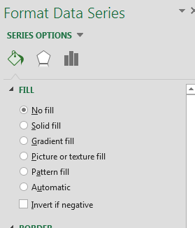
7. Then, click on no fill.

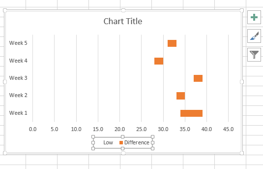
8. You will get a chart which will look like this:

Delete the legend. (Selected in the image)
9. Adjust the scale by right clicking on horizontal axis then go to format axis. Adjust the scale under axis options.
10. Final result would be like this:

Template
You can download the Template here – Download
Further reading:
Basic concepts
Getting started with Excel
Cell References


