Speedometer Chart in Excel

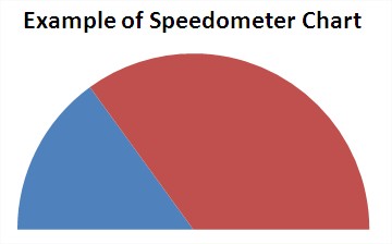
Here I showed data from a sample gauge chart. There are sales execution and sales plan. The graph does show the ratio of performance to plan.

Select the range B1: D2 and on the Insert tab, go to Charts group, click a pie chart and I choose the first plot:

The default format of the chart Select the graph and on the Design tab, choose the Chart Styles group of the style that suits me. Formatting corrected by style With the chart still selected on the Layout tab, in the Labels group, click a legend and choose None.

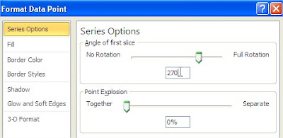
I note the green half circle by double clicking the left button. I note in this way, the data point. Keep in mind that this may not be quick double click. You need to click once (by selecting the series) and a second for the second time (by selecting the data point). After selecting a data point I click on it and choose the right Format Data Point. In the Format Data Point sets the angle of the first segment of the 270.

On the left side of the window choose the Fill and sees no fill.

Gauge Chart is ready. Looks quite nice. Its really reminds me car speedometer.

You can add some text to this graph. It is up to you.
Template
Further reading:
Basic concepts
Getting started with Excel
Cell References


