Ishikawa (Aka. Cause And Effect) in Excel
What Is an Ishikawa Diagram?
The cause and effect chart is one of the main and most popular tools for analyzing and solving quality problems in enterprises. Ishikawa diagram allows to identify the causes of actual or potential failures of various types of projects. It can be successfully used in industry, services, administration and project management. Cause-and-effect analysis was discovered by Professor Kaoru Ishikawa, a pioneer in quality management, in the 1960s.
Usually, we start each qualitative analysis by defining the problem and looking for its causes. The simplicity and broad functionality of the Ishikawa chart makes it one of the first steps in problem analysis.
Plotting the cause and effect chart must be an effort by many employees in the organization, as failure usually comes from different fields of activity. Therefore, the team should consist of people with high specialist knowledge who additionally want to reveal the causes of faults, including those caused by themselves. It can be used to organize a brainstorming session. It sorts ideas into useful categories instantly.
Ishikawa Diagram structure
Fishbone diagram consists of three parts:
- The first is “fish head”, which represents the analyzed problem, or rather failure to meet expectations and non-compliance with the specification.
- The next section is the “backbone” that identifies the root causes of the problem.
- On the other hand, “bones” directly pinpoint the causes of the problem.
The defect is noted at the end of the horizontal axis of the diagram. In the next phase, identify the main categories of possible causes of the problem (effect).
The most common Cause and Effect schema has five main classification groups:
- Man – all activities performed that result in a problem.
- Machine – the most common cause due to the fault of the machine
- Material – problems in this category are typically caused by components
- Method – means a method of performing an activity.
- Management – problems related to organization in the company.
- Environment – this group should consider the causes of problems in the workplace (eg. darkness).
During the diagram development phase, the above categories are modified depending on the needs, some of them may then be omitted or replaced with others.

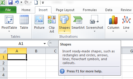
You can create ishikawa diagrams easily using Excel. You just have to insert the required shapes, whether arrows, rectangles or circles, and add the description. You can find all the required shapes and textbox (to insert the description) in the Insert –> Shapes menu option.
Create Ishikawa Diagram
Step 1. Open Excel and save your file as ishikawa-diagram.xlsx. Go to Insert (main menu) –> Shapes (in the Illustrations group) and select the first arrow in the Block Arrows section (circled in red).

Just drop in the arrow anywhere on your Excel worksheet. You can change the size, position or color of any shape using the Format menu option and you will see the Format menu option only if you select the shape to be formatted.
![]()
Once you insert the arrow, your screen will look like this:

The size, position and color of your arrow could be different. Make sure that your arrow is lengthy enough with enough space at the top and bottom so that you can insert other spikes.
Step 2. Go to Insert (main menu) –> Shapes (in the Illustrations group) and select the second arrow (single headed arrow) in the Lines section.

Drop in the arrow anywhere on your Excel worksheet. Then, drag it in such a way that its arrow touches the main arrow we positioned in Step 1.
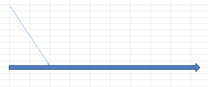
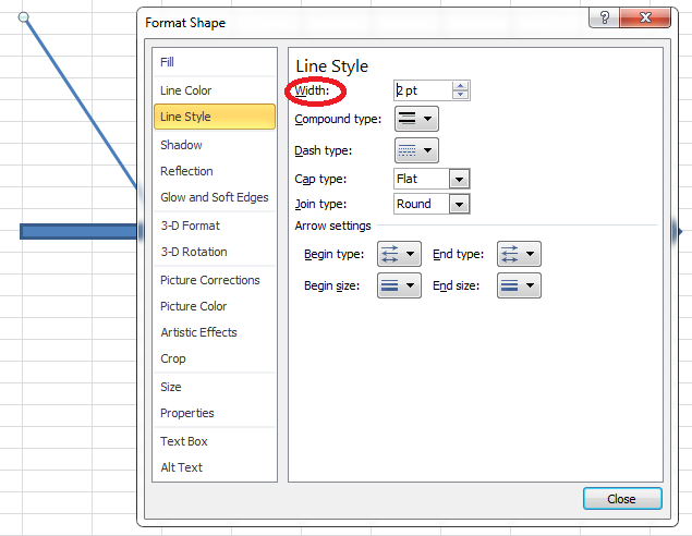
You can make this single headed arrow thicker. Right click the arrow and click Format Shape option.

Increase the value of Width from the Line Style window.
Click the Close button. Now your screen will look like this:
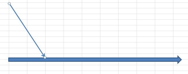
Step 3. To create more single headed arrows at the top of the main arrow, right click the arrow created in step 2 and copy (CTRL + C) and paste (CTRL + V) it as many times as the number of arrows you need at the top. Place them in the correct positions so that all of them converge into the main arrow. You can adjust the length of the main arrow if you want.

Step 4. Next to create arrows for the bottom of the main arrow, copy one single headed arrow at the top and paste it somewhere on the worksheet. Right click the copied single headed arrow and select Size and Position option.

Change the value of Rotation from the Size section appropriately so that the arrow can be converged into the main arrow.
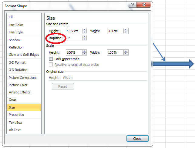
Close the window. Place the arrow in such a way that it just touches the main arrow. Now your screen will look like this:

Step 5. To create more single headed arrows at the bottom of the main arrow, repeat step 3.

Step 6. To add text descriptions, go to Insert–>Shapes and select Text Box (first object in Basic Shapes section).

Drop it in the worksheet where you want to insert description. Add the description by just clicking inside the textbox and typing whatever you want.

You can format the content inside the textbox going to Home option as you normally format the content.
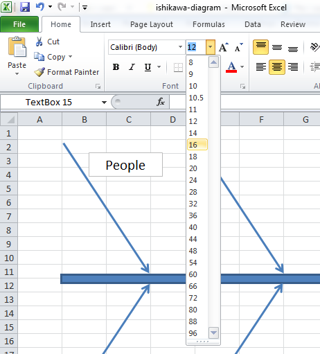
You can format the appearance of the textbox as you want by selecting the textbox and going to Format menu option.

Step 7. Copy and paste as many text boxes as you want and place them in correct positions with proper descriptions. Also add a textbox at the end of the main arrow and provide a description that explains the actual problem that is being analyzed.

Step 8. Repeat from step 2 in order to add more spikes which point to each of the single headed arrows. Format and position them appropriately with proper text descriptions. Your final ishikawa diagram will have a structure like this: (Of course, there will be differences in the size, color, position, text descriptions, number of spikes etc. Still, the basic structure will be the same.)
After making the Ishikawa diagram, it is necessary to analyze it and draw conclusions which of the examined causes contribute most to the occurrence of the undesirable effect, and take actions to eliminate them. During the discussion, a hierarchy of occurring causes can be defined, which is determined:
- based on the views of the diagramming engineers,
- based on the figures,
- by assigning each potential cause a probability of occurrence.
Thanks to this, it is possible to determine the critical causes that have the strongest impact on the result, the removal of which can begin the process of introducing corrective actions – for events that happened and preventive – for potential threats.
Template
Further reading:
Basic concepts
Getting started with Excel
Cell References


