
Doughnut Chart Excel
MS Excel or Microsoft Excel is the most popular spreadsheet software with special built-in features and a wide range of functions. When presenting spreadsheet data graphically, Excel offers several options. We can use various shapes, images, clip-arts and even charts to make our spreadsheets attractive and informative.
Using the charts in Excel, we can quickly display our data graphically. The Doughnut Chart is one of the most popular chart types in MS Excel, and it can be used with special formatting features to represent the data clearly within the Excel sheet and make the chart easier to read.

In this article, we discuss the brief introduction of the Excel Doughnut Chart. This article also explains the step-by-step process of creating a Doughnut chart in an Excel worksheet with examples.
What is Doughnut Chart in Excel?
As the name suggests, the Doughnut Charts in Excel typically make a doughnut-shaped structure or a figure with the supplied data set. The Doughnut Charts are almost similar to the Pie charts but contain a hole in the middle. These charts are often referred to as an extended or modified version of the Pie Charts. Unlike Pie Charts, the Doughnut Charts do not require comparing the size or area of the slices to measure. Instead, they are usually measured based on the length of the arc in a ring.
In other words, a Doughnut Chart can be defined as a stacked bar chart that is rotated around itself so that its ends connect and form a circle. Doughnut Charts are preferred over pie charts as they have a better data intensity ratio and better space efficiency. The middle hole in a Doughnut Chart is also useful because we can use this space to add relevant data, such as the data labels of the slices, the total number of data arcs, desired text, etc. Another advantage of Doughnut Charts over Pie Charts is that we can use more than one data series at a time in these charts.
The Doughnut Chart has mainly two subtypes:
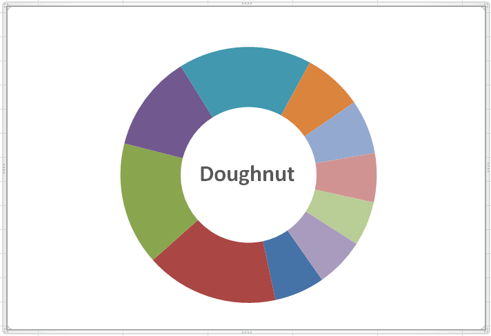
- Doughnut: The Doughnut Charts represent data in the form of rings. Each ring of this type of chart represents or highlights a data series. In other words, if we display data labels in percentage for each part of the ring, the entire ring will cover exact 100%, making a Doughnut. In this chart, the part or slices of the ring are attached and are not puller apart.
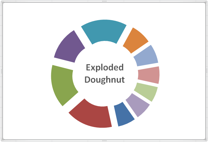
- Exploded Doughnut: The Exploded Doughnut Charts represent data in the form of broken or separated ring parts. It showcases the contribution of each value to a total while emphasizing separated values. The primary advantage of Exploded Doughnut Chart is that it can easily represent more than one data series.
Note: The Doughnut chart and Exploded Doughnut Chart are not present in a 3-D format in Excel. However, we can use 3-D formatting styles to make these charts look like 3-D representations. In Excel 2016 and later versions, Microsoft removed Doughnut Charts favouring the new chart type name Starburst Charts.
Advantages of using Doughnut Charts in Excel
Some essential advantages of using the Doughnut Charts in Excel are listed below:
- Doughnut charts are easy to create and easy to understand by readers. There is minimal need to explain these charts, even for those who do not know the basics of Excel charts.
- Upon creating the Doughnut Charts in Excel, the percentage value is calculated automatically.
- When comparing sets of data in Excel, the Doughnut Charts help represent data neatly and visually accurate.
- Unlike Pie Charts, the Doughnuts charts can represent multiple data sets in an Excel sheet. Additionally, we can easily change or replace data values in Doughnut Charts in real-time as per our requirements.
Disadvantages of using Doughnut Charts in Excel
Some essential disadvantages of using the Doughnut Charts in Excel are listed below:
- If there are too many categories in our data, the Doughnut Chart displays too many slices or arcs in a ring, respectively. This sometimes makes graphical representation cluttered and dense.
- Data distribution or representation is strictly limited to parts of the whole data.
- It isn’t easy to calculate the exact size or length of slices unless they are represented to each other, and it makes comparing the relative size of slices difficult in the Doughnut Charts.
- Doughnut charts cannot be used to show data changes that occur over a specific time, and these charts are considered poor in showing change over time.
When should we use the Doughnut Chart in Excel?
We should consider using the Excel Doughnut Chart in the following scenarios:
- When we have one or more data series to plot.
- When the data that we want to plot has no negative values.
- When the data that we want to plot has no zero values.
- When we have more than seven categories per data series.
- When we have data where categories make whole part in each ring of the Doughnut Chart.
How to create Doughnut Charts in Excel?
Although creating a Doughnut Chart is similar to inserting other typical chart types in Excel, we must be careful inserting it because it can accept more than one data series. It is a built-in chart type in Excel older versions and can be easily inserted to represent the part of data as slices, where the total of all parts is 100%.
Since the Doughnut Charts can be used for one and more data series, we discuss the process of inserting these charts in different scenarios, such as:
- Creating a Doughnut Chart using Single Data Series
- Creating a Doughnut Chart using the Double Data Series
- Creating a Doughnut Chart using Multiple Data Series
Creating a Doughnut Chart using Single Data Series
When we insert a Doughnut Chart in Excel using the single data series, the inserted chart is usually called a Single Doughnut Chart. Let us now insert a Single Doughnut Chart in Excel using the following example data:
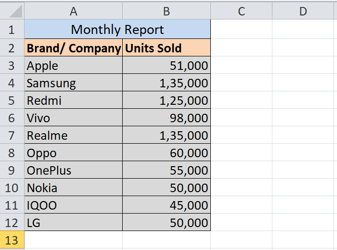
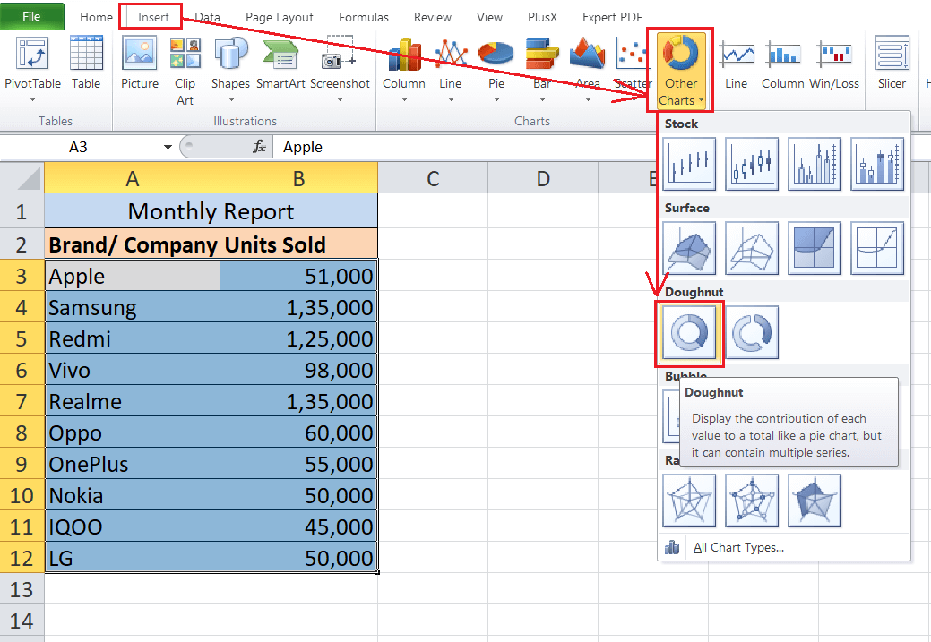
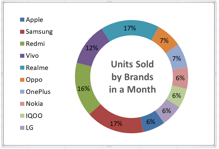
Consider the following Excel sheet that displays some sample data of sold mobile devices in the previous month by ten different brands:
We need to display the above data graphically in Doughnut Chart. For this, we need to perform the following steps:
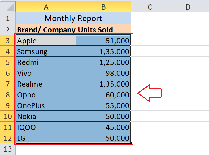
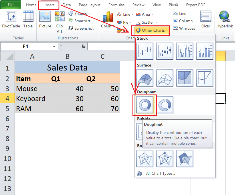
- First, we need to select the entire range of cells with effective data. In our example, we select the data from cell A3 to cell B12, as shown below:
- Next, we need to select the Doughnut Chart from the built-in Excel charts. For this, we need to navigate to the Insert tab and select the Other Chart drop-down menu. We need to click the Doughnut Chart from the drop-down section of the Other Chart, as displayed in the following image:
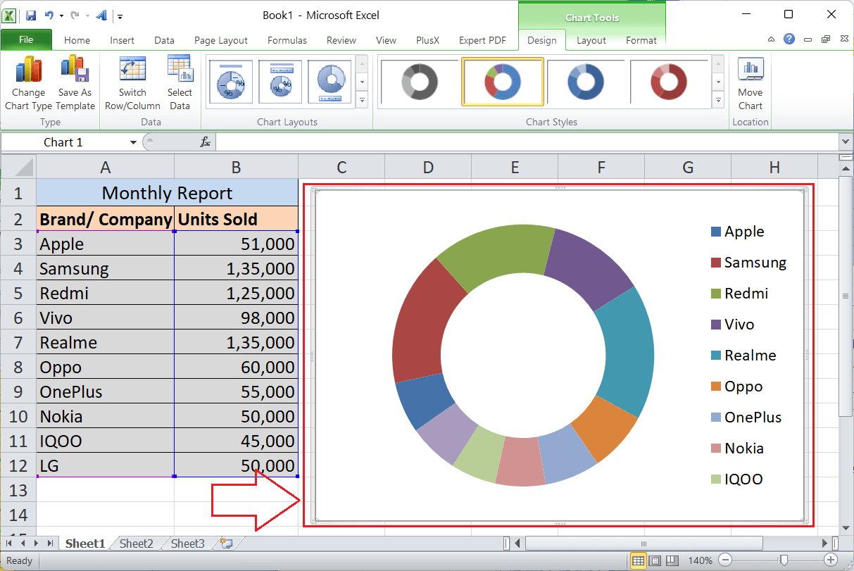
In Excel 2013, we need to select the Doughnut Chart under the Pie Chart drop-down section. - As soon as we select the Doughnut Chart, the chart is inserted within the sheet. For our example data, the Doughnut Chart looks like this:
After the Doughnut Chart is inserted into the sheet, we need to adjust some basic formatting to make it look beautiful and properly organized. We can add multiple chart elements and formattings. Some basic customizations are as follows:
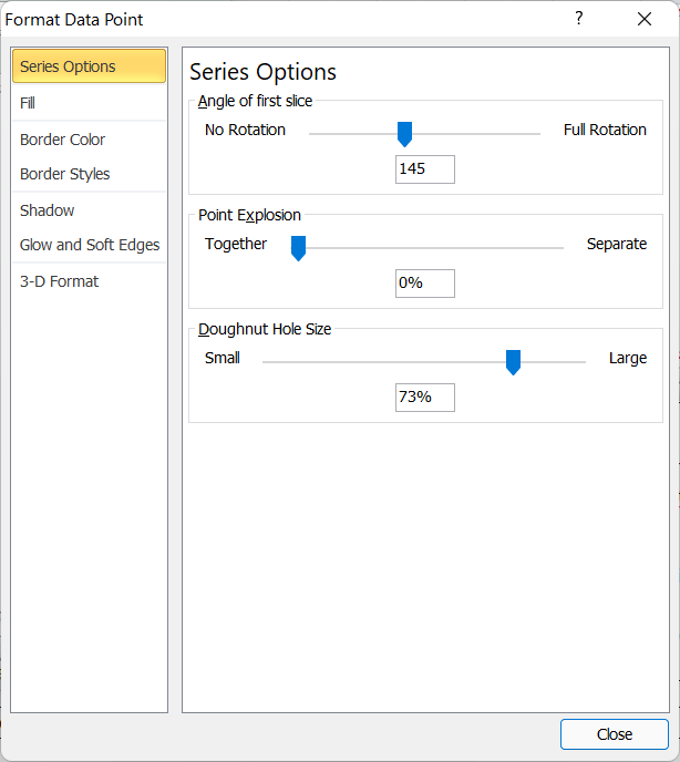
- We need to select the slices of the ring and use the shortcut Ctrl +1 to access the quick toggle menu of Format Data Series. Under the Format Data Series menu, we can adjust the angle of the first slice, Doughnut Explosion, Doughnut Hole Size, etc. Suppose we adjust the preference manually like the below image:
Now, our Doughnut Chart will look like this:

- Next, we right-click on the slice and select Add Data Labels option to make our chart informative.

Excel will insert the data labels in default style, and we will get the corresponding value (sold units values) for each brand in respective slices. After adding default data labels, our example data in Doughnut Charts will look like this:

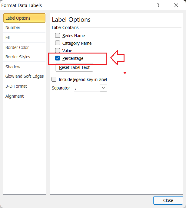
- Since data labels look more professional when used in percentage, we will change the default style. For this, we need to double-click on the data label or press the shortcut Ctrl + 1 after selecting any data label. It will launch some options to modify data labels accordingly. We need to select the checkbox for the option name Percentage and leave all other label options unmarked, as shown below:
- Lastly, we insert/edit the chart title and move the legend to the left side to make the overall presentation more beautiful and professional. After the final step, our example Doughnut Chart looks like this:
Additionally, we can also change the colours of the slices and insert other chart elements as per our requirements.
That is how we can insert a Single Doughnut Chart in Excel.
Creating a Doughnut Chart using the Double Data Series
When we insert a Doughnut Chart in Excel using the two data series or matrices, the inserted chart is usually called a Double Doughnut Chart. Let us now insert a Double Doughnut Chart in Excel using the following example data:
Consider the following Excel sheet that displays some sample data of sold items (Mouse, Keyboard, RAM) on first two quarters:

We need to display the data of both quarters graphically in Doughnut Chart. For this, we need to perform the following steps:
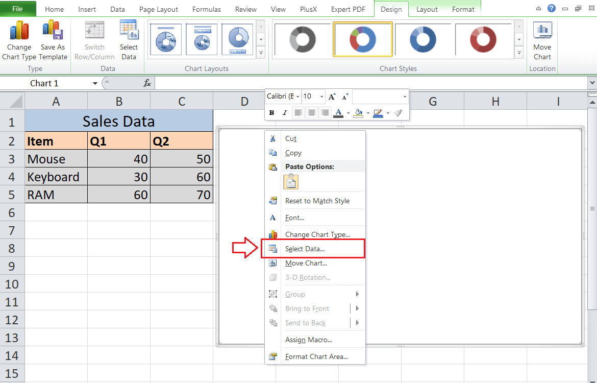
- When we have more than one data series, it is good first to insert a blank Doughnut Chart and then select the data manually to eliminate the chances of incorrectness. Therefore, we go to the Insert tab and select the Doughnut Chart from the Chart section to insert a blank Doughnut Chart.
- Next, we need to right-click on the blank chart and click on the Select Data option, as shown below:
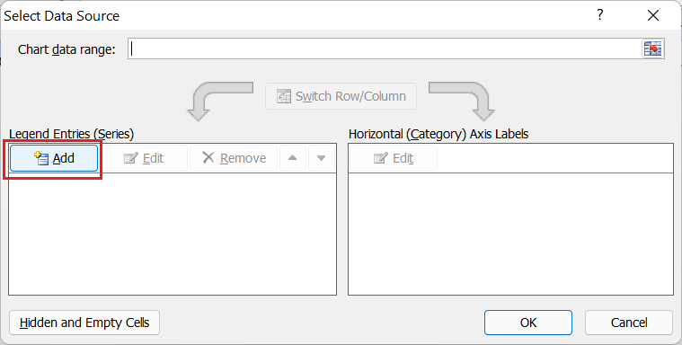
- We need to click the Add button to insert the desired data from the sheet on the Select Data Source window.
- In the next window, we need to select the header cell of the series one under the Series name box and select the first series data under the Series values box, as shown in the following image:

- We have two series of data, and so we repeat the same for the second series. We need to click on the Add button again and select the data from the second series (Q2), as shown below:

- Next, we need to click the Edit button from the right-hand side of the Select Data Source window.

- In the next window, we must supply the item names under the Axis label range box.

- Lastly, we need to click the OK button, and the Doughnut Chart for our data with default formatting will be instantly inserted in the sheet, as shown below:

Although the Doughnut Chart has been inserted, it is not so helpful. Thus, we must arrange to format accordingly. After arranging the formatting in Double Doughnut Chart like the previous method, our chart looks like this:

That is how we can insert a Double Doughnut Chart in Excel.
Creating a Doughnut Chart using Multiple Data Series
When we insert a Doughnut Chart in Excel using more than two data series or matrices, the inserted chart is usually called a Multiple Doughnut Chart. Creating a Multiple Doughnut Chart in Excel is almost similar to inserting the Double Doughnut Chart. The only difference in the Multiple Doughnut Chart is that it requires multiple metrics.
Let us now insert a Multiple Doughnut Chart in Excel using the following example data:
Consider the following Excel sheet (same as previous but with 4 quarters of data) that displays some sample data of sold items (Mouse, Keyboard, RAM):
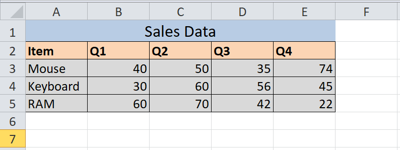
We need to display the data of all quarters graphically in Doughnut Chart. For this, we need to perform the following steps:
- Like the previous method, we first insert a blank Doughnut Chart from Insert > Charts Section and then press right-click on the blank chart. We need to choose Select Data from the right-click menu.

- Next, we need to click the Add button to select source data for the Doughnut Chart.

- In the next window, we must select the header cell of series one (Q1) under the Series name box and select the first series data under the Series values box. Similarly, we need to click the Add button for other quarters and provide the data.

- After that, we need to click the Edit button from the right-hand side of the Select Data Source window. Here, we need to provide the item names under the Axis label range box.

- Lastly, we must click the OK button to get the Doughnut Chart on the sheet.

After the chart has been inserted, we must arrange to format it accordingly. After arranging the formatting in Multiple Doughnut Chart like the previous method, our chart looks like this:

That is how we can insert a Multiple Doughnut Chart in Excel.
Important Things to Remember
- Doughnut Charts are similar to pie charts with a hole in the centre.
- Doughnut Charts help to create visualizations with single matrices, double and multiple matrices.
- Doughnut Charts mostly help to create a chart for the total 100 percentile metrics.
- It is possible to create Single Doughnut, Double Doughnut and Multiple Doughnut charts based on the data series we have to plot a graph.


