How To Insert Thermometer Chart In Excel
To create a thermometer goal chart in Excel, you need a data. One cell should show the current value, and the second is the target value. On this basis, calculate the percentage.

Select the cell with percentage and go to the ribbon. In the Insert tab, Charts group, click Column, and select the Clustered Column chart.
Your chart at the moment looks like this:
Thermometer Chart formatting
You must now adjust the formatting.
Right-click on the left axis (eg on one of the numbers) and from the menu choose Format Axis.
In the Axis Options, next to Maximum beside Fixed type 1.
Next right-click the blue bar and choose Format Data Series.

Change Gap Width to 0 %.
Right-click a blank area over a blue bar between the horizontal lines and select Format Plot Area.
On the left edge of the page, select Border Color and choose the Solid Line. Below select the blue Color.
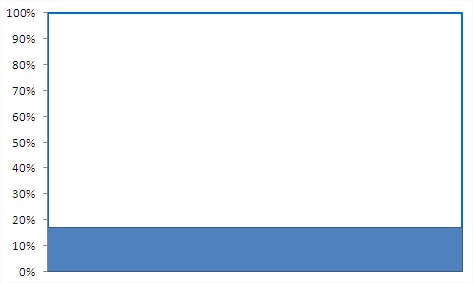
Your chart now looks like this:

Select the entire chart (click anywhere on the chart). Go to Ribbon > Layout tab. Click Legend / None
Axes > Primary Horizontal Axis > None
Gridlines > Primary Horizontal Gridlines > None
Thermometer Chart is just almost ready.

It needs to be much more such as thermometer. Change the size of the chart. Narrow it and increase the height to be more like a mercury in thermometer.

The effect of the thermometer is even better when you insert the oval on the bottom of the goal chart.
Go to Ribbon> Insert> Illustrations > Shapes. Choose the Oval and adjust it to the chart.

Here is the effect of your work. Thermometer Goal Chart is ready!
Template
Further reading:
Basic concepts
Getting started with Excel
Cell References


