Pie Chart
Pie charts are used to display the contribution of each value (slice) to a total (pie). Pie charts always use one data series.
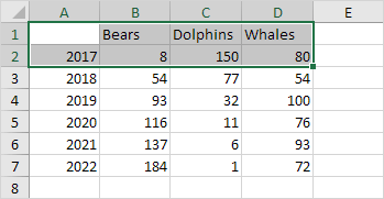
To create a pie chart of the 2017 data series, execute the following steps.
1. Select the range A1:D2.
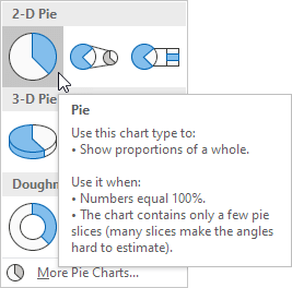
2. On the Insert tab, in the Charts group, click the Pie symbol.

3. Click Pie.
Result:

4. Click on the pie to select the whole pie. Click on a slice to drag it away from the center.
Result:

Note: only if you have numeric labels, empty cell A1 before you create the pie chart. By doing this, Excel does not recognize the numbers in column A as a data series and automatically creates the correct chart. After creating the chart, you can enter the text Year into cell A1 if you like.
Let’s create one more cool pie chart.
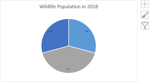
5. Select the range A1:D1, hold down CTRL and select the range A3:D3.

6. Create the pie chart (repeat steps 2-3).
7. Click the legend at the bottom and press Delete.
8. Select the pie chart.
9. Click the + button on the right side of the chart and click the check box next to Data Labels.

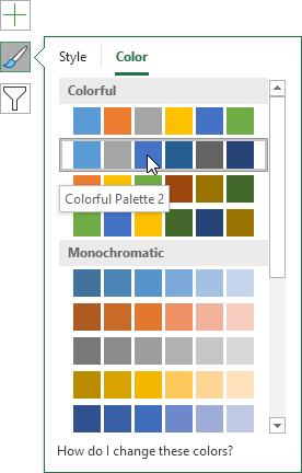
10. Click the paintbrush icon on the right side of the chart and change the color scheme of the pie chart.
Result:
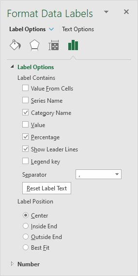
11. Right click the pie chart and click Format Data Labels.
12. Check Category Name, uncheck Value, check Percentage and click Center.
Result:

Note: right click the data labels and click Font to change the font size and font color of the data labels.
Next Chapter: Pivot Tables


