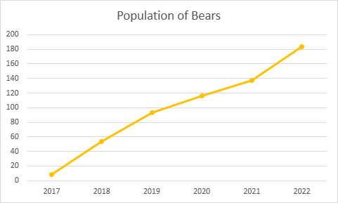
Line Chart
Line charts are used to display trends over time. Use a line chart if you have text labels, dates or a few numeric labels on the horizontal axis. Use a scatter plot (XY chart) to show scientific XY data.
To create a line chart, execute the following steps.
1. Select the range A1:D7.

2. On the Insert tab, in the Charts group, click the Line symbol.

3. Click Line with Markers.

Result:

Note: only if you have numeric labels, empty cell A1 before you create the line chart. By doing this, Excel does not recognize the numbers in column A as a data series and automatically places these numbers on the horizontal (category) axis. After creating the chart, you can enter the text Year into cell A1 if you like.
Let’s customize this line chart.
To change the data range included in the chart, execute the following steps.
4. Select the line chart.
5. On the Design tab, in the Data group, click Select Data.

6. Uncheck Dolphins and Whales and click OK.

Result:

To change the color of the line and the markers, execute the following steps.
7. Right click the line and click Format Data Series.

The Format Data Series pane appears.
8. Click the paint bucket icon and change the line color.

9. Click Marker and change the fill color and border color of the markers.
Result:

To add a trendline, execute the following steps.
10. Select the line chart.
11. Click the + button on the right side of the chart, click the arrow next to Trendline and then click More Options.

The Format Trendline pane appears.
12. Choose a Trend/Regression type. Click Linear.
13. Specify the number of periods to include in the forecast. Type 2 in the Forward box.

Result:

To change the axis type to Date axis, execute the following steps.
14. Right click the horizontal axis, and then click Format Axis.

The Format Axis pane appears.
15. Click Date axis.

Result:

Conclusion: the trendline predicts a population of approximately 250 bears in 2024.
Next Chapter: Pivot Tables


