Chart with negative values
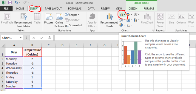
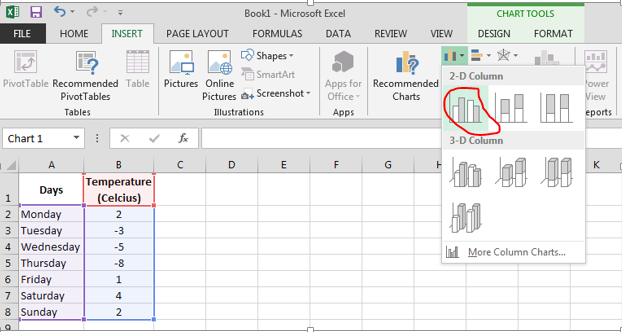
 Click insert column chart and select clustered column chart.
 A graph will appear in the Excel sheet. Axis can be adjusted by right clicking on the axis and selecting format axis. (Axis adjustment shown in the next steps).

Scales can be adjusted by right clicking vertical axis and then selecting format axis. A dialog box will appear. Now adjust the vertical axis accordingly.

You will see the changes in the graph.

Template
You can download the Template here – Download


