
Chart with filtered data

The table looks like follows:

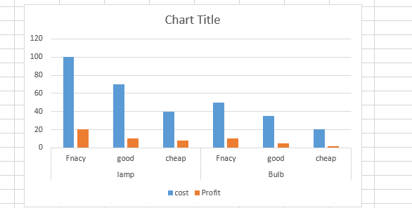
Create a chart from the same now:

The chart will look like this:
Now we can easily filter the category as shown below:

After filtering the graph will look like this:
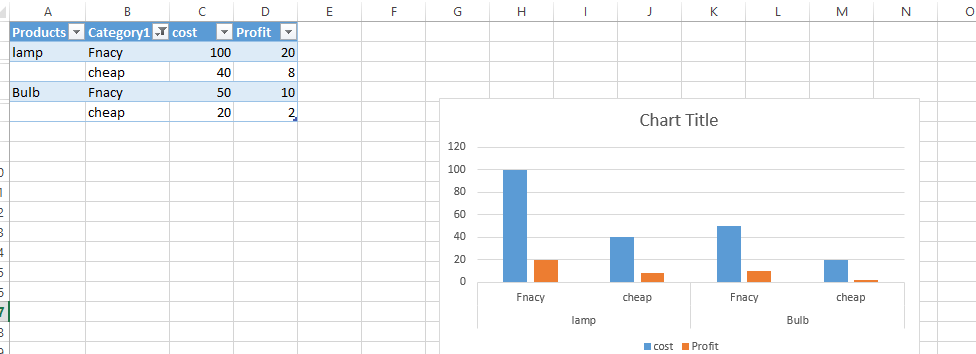
We can also try to remove a product from the list of products. Please note that this is a small table but for more number of products and more categories it will be very handy to filter the table and how it reflects on the charts instantly:

Product disappeared from the chart:

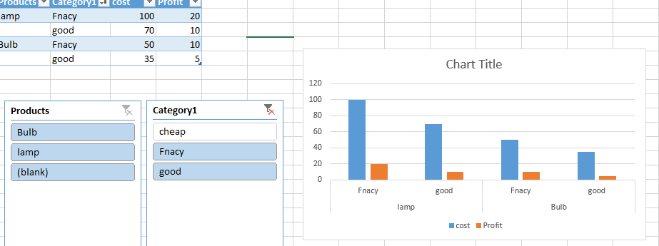
We can insert slicer like this also:

This is how slicers look like:

It will very easy to click on the slicer values instead of the filtering:
Template
You can download the Template here – Download
Further reading:
Basic concepts
Getting started with Excel
Cell References


