
How to Insert Area Chart
When to use Area Chart?
Area charts are used to describe changes over time. If the coordinate system is used when drawing up the graphs, we usually put the feature values on the horizontal axis and the values of the feature on the vertical axis of the number (frequency) of the feature variants.
In the case of time series, on the horizontal axis, we mark moments or periods of time, and on the vertical axis, the quantities (or dynamics) of the studied phenomena. The scale on the abscissa axis does not depend on the adopted scale on the ordinate axis. We also often use line charts to present time series.
How to insert Area Chart in Excel?
To insert Area Chart in Excel you need to have a data ready which would be something like this:

Mark the whole data, as it is showing in the picture below

Click on the Insert tab on top.

Click on the area chart (1), and choose if you want to have a 2-D or 3-D chart (2).

Types of Area Charts in Excel
These are types of Area Charts you can choose. Just choose the one you like the most.
2D Area Chart
 2D Stacked Area Chart
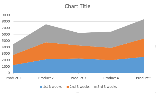
 2D 100% Stacked Area Chart
 3D Area Chart
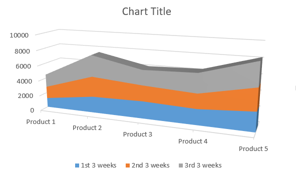
 3D Stacked Area Chart
3D 100% Stacked Area Chart 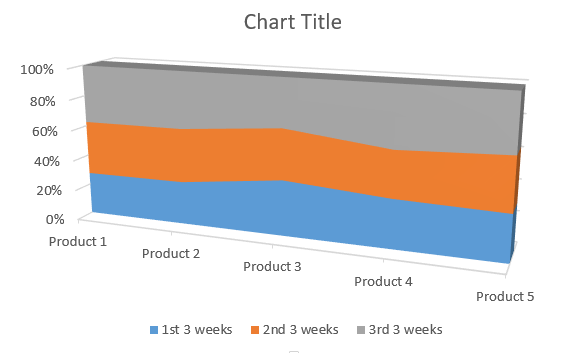
Which Area Chart to Choose?
- Stacked or cumulative (regular)? – you should use stacked charts when you need to combine the data. The moment you need to sum the data up to show something is when you should choose Stacked Area Charts. Stacked Are Charts are also better when data are overlap each other which makes the chart harder to analyze.
- 100% or regular? – 100% Stacked Area Charts are for you when you the sum of data is crucial only as a part of the whole population
- 2D or 3D? – this is the toughest choice. Call me old fashioned but I prefer 2D. It is easier for me to see the visualization of data. 3D Area Charts are better in less format spreadsheets.
Note: You can now design the chart as you want, add a chart title by simply clicking on it.
Template
Further reading:
Basic concepts
Getting started with Excel
Cell References


